Photography: The Forgotten Child of Branding

Alix Wolfe
Design Director

Poppins' Design Director, Alix Wolfe, shares why photography is just as important as the logo when it comes to building brand perception and emotive storytelling.
Mingling in a room full of people at a party with friends old, new and those I've yet to meet, a stereotypical introduction always finds a way to the surface: "Meet my friend Alix, she's a graphic designer." And without even skipping a beat I hear, "Ah so you make logos, cool."
Yes, graphic designers make logos, but they do so much more than that. They build brands. More specifically they build what will become a brand's perception, by stringing together a visual narrative that encompasses everything the light touches. (Yes, I'm referencing the Lion King, Disney please don't sue me.) So what does the light touch?
"Every product, every communication, every conceivable point of contact with a customer or potential customer contributes to this [brand] perception."
Creative Review
You can't just slap a logo on everything and call it a day. (In theory, you can, but that would be sooo boring.)
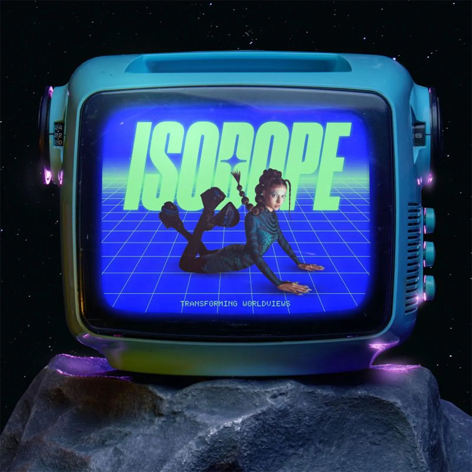
Photography is a way of emotive storytelling. The old adage, "A picture is worth a thousand words' has stood the test of time for a reason. Plus, emotional attachment is the biggest driver of brand value, 43% to be exact (Forbes). Photos are used in ads, on websites, on social media...Yet, more and more I'm finding brands are removing this from their arsenal altogether when it comes to building their brand. I don't mean they're not using photography, I mean they're not utilising photography in a way that elevates their brand narrative. It's become an afterthought, left to scrape the dregs of stock image libraries. But why?
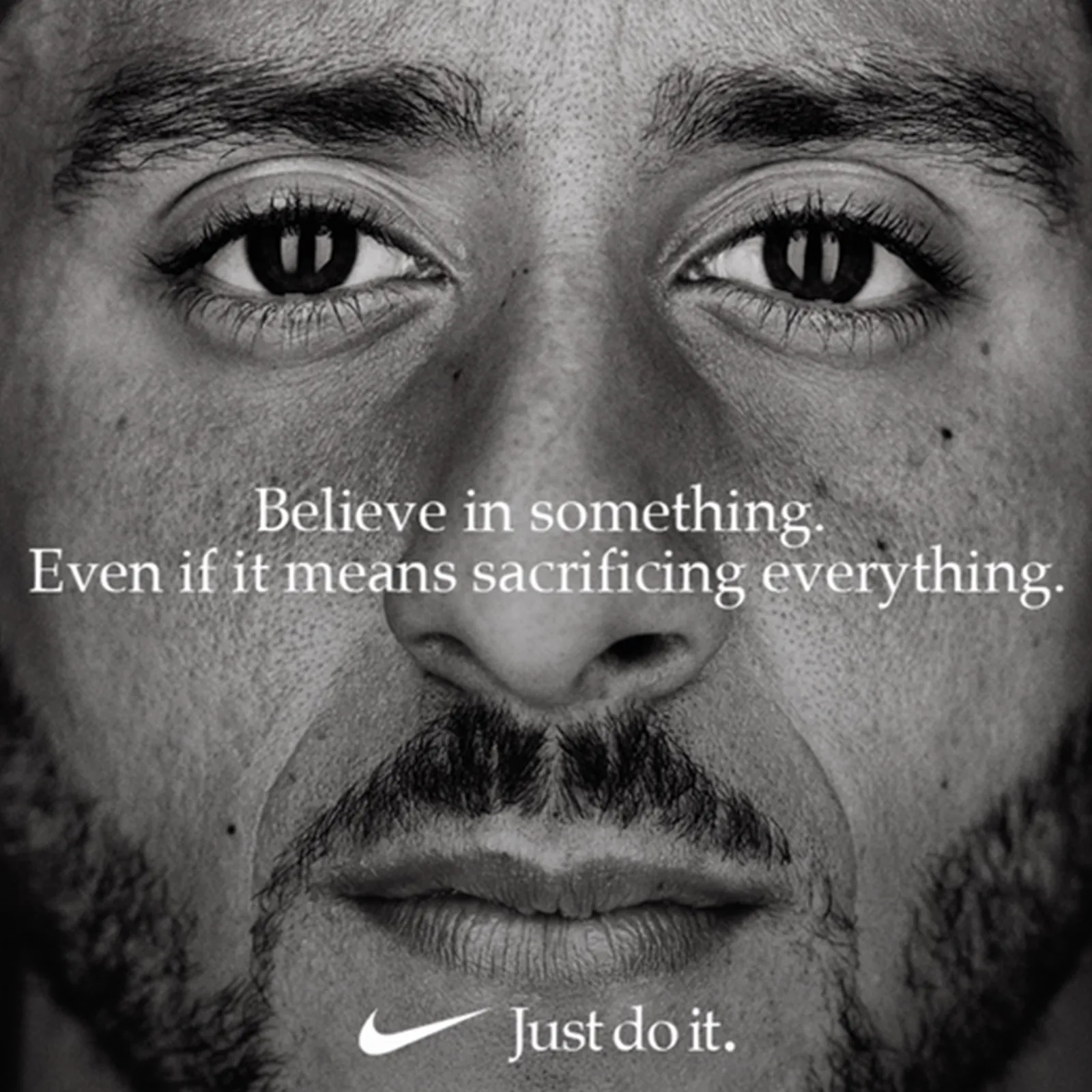
Look to the likes of Nike and National Geographic and you'll see brands that have capitalised on the use of photography to elevate their brand. Nike isn't just selling shoes, they're selling an idea. Have you ever noticed how some Nike ads don't even include a product? That's because you don't need to see a shoe to know the ad is for Nike.
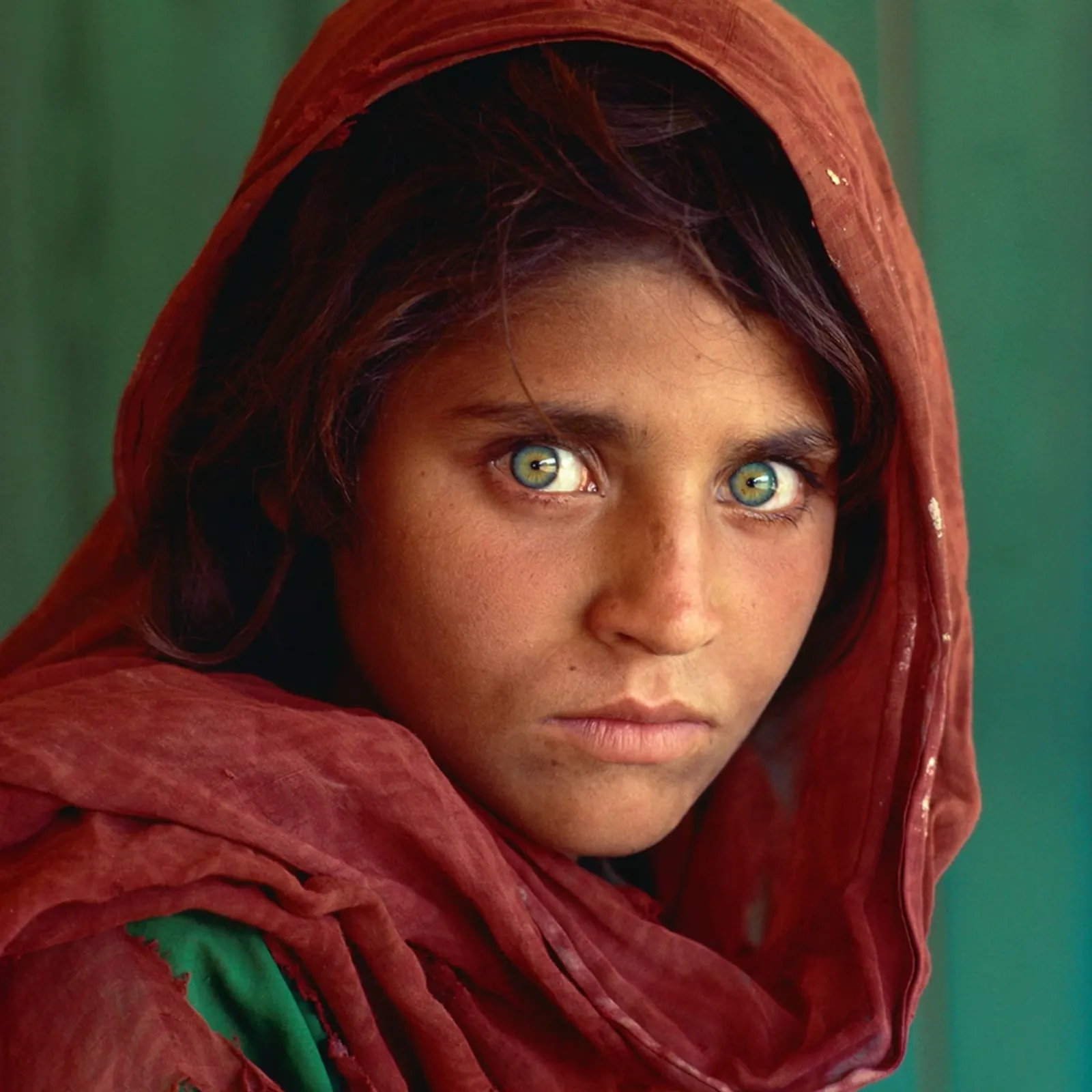
National Geographic owns their photographic style so entirely that there are countless articles, classes, and YouTube videos giving tips on how to emulate it for yourself. It's a style that uses strong colour, super crisp details and unique perspectives to pull you in and transport you to another place. Which makes perfect sense, given their brand purpose is to illuminate and protect the wonders of our world. It's emotive storytelling at its finest.
Would Nike or National Geographic have achieved such high success had they not utilised photography to build brand perception? Who's to say? (Actually, I'm saying—absolutely not). Recently I came across two online ads, one for Skyscanner and one for Expedia (or was it Kayak? I can't remember, which proves my point.) Both used images. Almost identical stock images. Take away any of the other branding elements and you wouldn't be able to tell the difference between them. They've become interchangeable.
Stock libraries are chock full of thousands of images that any brand can access (for a fee, of course). If any brand can access the image you're about to use, it's no longer a brand asset. It's stopped contributing to the brand perception, and started contributing to the category perception. Additionally, stock imagery is full of bias. Search "doctor" on Getty Images and the majority of the images are of older white males. Don't even get me started on trying to find someone who's wearing the right thobe from Saudi Arabia; Getty Images thinks they're all the same.

The reality is, stock imagery isn't all bad. It's a great resource for the brands that might not be able to create to scale on their own, given budgets or timelines. It's also a great place to gather material to create something new, whether that be altering those images, creating collages or whatever else the mind can conjure up.
Personally, I will always be of the camp that photoshoots are best; they give brands complete control. Who are the models? You choose them! What are they wearing? You pick the wardrobe! (Well the stylist does, then you just say yes or no!) What does the set look like? You design it! (Again, actually the set designer does that, but you get the picture.)
But sadly budgets don't always allow for that (even though they really, really should). Budgets are tight. So what? Everyone else's budget is tight. We're in a cost of living crisis for goodness sake, (and someone who must not be named is trying to collapse the world economy so his buddies can get richer.) So, what do we do when budgets are tight? We go to AI.
AI can be a great tool. It makes things fast and it makes things cheap, but it does not make things well. Cue hands with seven fingers and slabs of salmon in a river (a reference for only the perpetually online). So AI is just that, a tool. It doesn't do the thinking for you, but it can help make that thinking a reality.
Back in 2022 &Walsh used DALL-E to create almost an entire brand built from AI. "Unlike other AI-driven projects—where stylistic results are guided by the capabilities and look of the program used—Dall-E was utilised as a source of inspiration as much as a design tool." (It's Nice That) While photographic backgrounds were created using AI, there was a high level of art direction done by humans. On the flip side that same year Cosmopolitan created the cover of their magazine entirely with DALL-E 2 with the help of Karen X Cheng, a digital artist. The prompt?
"Wide–angle shot from below of a female astronaut with an athletic feminine body walking with swagger toward camera on Mars in an infinite universe, synth wave digital art"
Cosmopolitan

Recently we used AI in the studio to create hero brand imagery for a startup that's all about championing lemons. Why? Purely practical reasons. We needed images of lemons. And not just any lemons, but very specific lemons only grown in the south of Italy. And it was December. And we had sold in a very specific art direction that could only be achieved through a photoshoot...which was not in the cards. No lemons, no images. So we used Midjourney to bring to life what was in our heads: photography reminiscent of those Renaissance style still life paintings with rich colours and dark backgrounds, but with very specific subject matter—the Sfusato lemon.
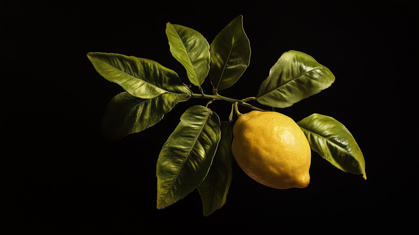
What Midjourney out put wasn't too shabby. But it did require some retouching, and those images can't be used above a certain size as the resolution isn't high enough. What we did get out of it though was an ownable image style that marries with the rest of the brand identity perfectly. We built the full kit and caboodle for our clients which they can now use to start to build brand perception, well beyond the logo.
So I leave you with this, if photography is such an important part of building brand perception and brand value, what the heck are you doing not investing in it?
If anything you've read here piques your interest, we'd love to hear from you at hello@poppins.agency
Why don’t you check out...
Branding in the legibility era
Purpose-driven branding no longer cuts it. Today's consumers demand transparency over manifestos, here's why showing your operational reality is the new standard for building lasting brand trust.
Branding in the legibility era
Purpose-driven branding no longer cuts it. Today's consumers demand transparency over manifestos, here's why showing your operational reality is the new standard for building lasting brand trust.

The untapped fans that auto/moto brands need to know about.
Strategy Director Tom Rabin explains the growing importance and untapped opportunities in prioritising fandom over loyalty.

The Leadership Blindspot Harming Your AI Transformation
Poppins’ Vice President of Product & Operations delves into how AI is reshaping product development.