AMI
NATURAL INTELLIGENCE.
Brief
Many Americans might struggle to make sense of their health insurance, let alone the treatments and research available to them. American Medical Intelligence (AMI) came to us with a plan to change that, and needed a brand to match. Its AI, built to draw only on medical journals and studies, powers an app for patients and a platform for clinicians. AMI’s app will help people understand what their insurance covers, flag a clinical study you could join, and suggest what to ask your doctor. We set out to make this new kind of intelligence feel trustworthy, taking our cues from the natural world.
deliverables
- Brand Strategy
- Visual Identity
- Brand Collateral
- Verbal Identity
- UX/UI Designs
- Marketing Website
GROUNDED THINKING
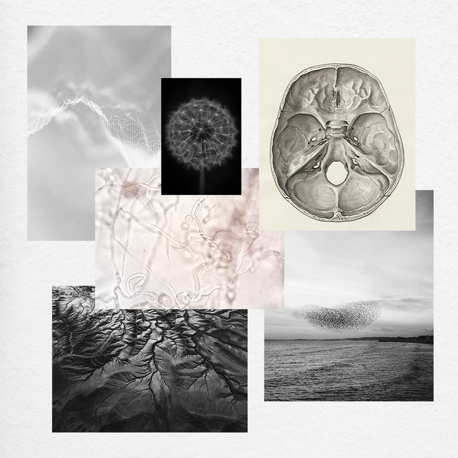
The information people need to manage their healthcare already exists, but it’s scattered across insurance plans, doctors and medical journals, leaving patients to join it up themselves. AMI does the joining for them. Ask it “What are my options?” and it draws on all of those sources at once to answer. We positioned AMI as the connective intelligence healthcare has always needed, and gave it a rallying cry for a company set on doing things differently: innovation drives progress. For the identity, we looked to nature for a system that already works this way, and found it underground, in the vast networks fungi use to link a whole forest together.
HIDDEN IN PLAIN SIGHT
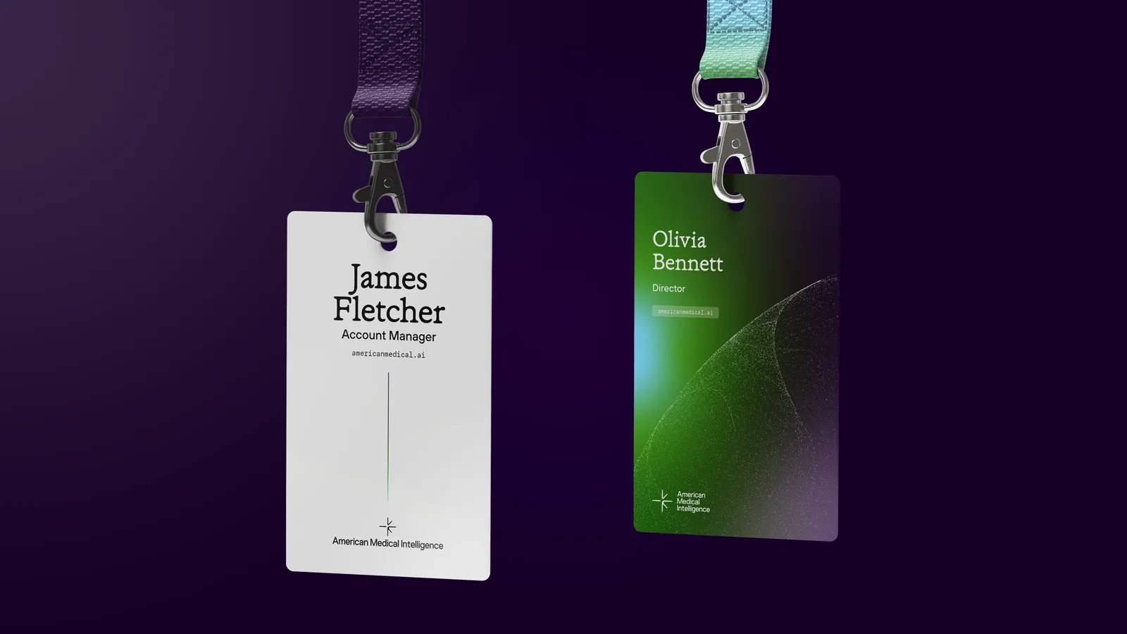
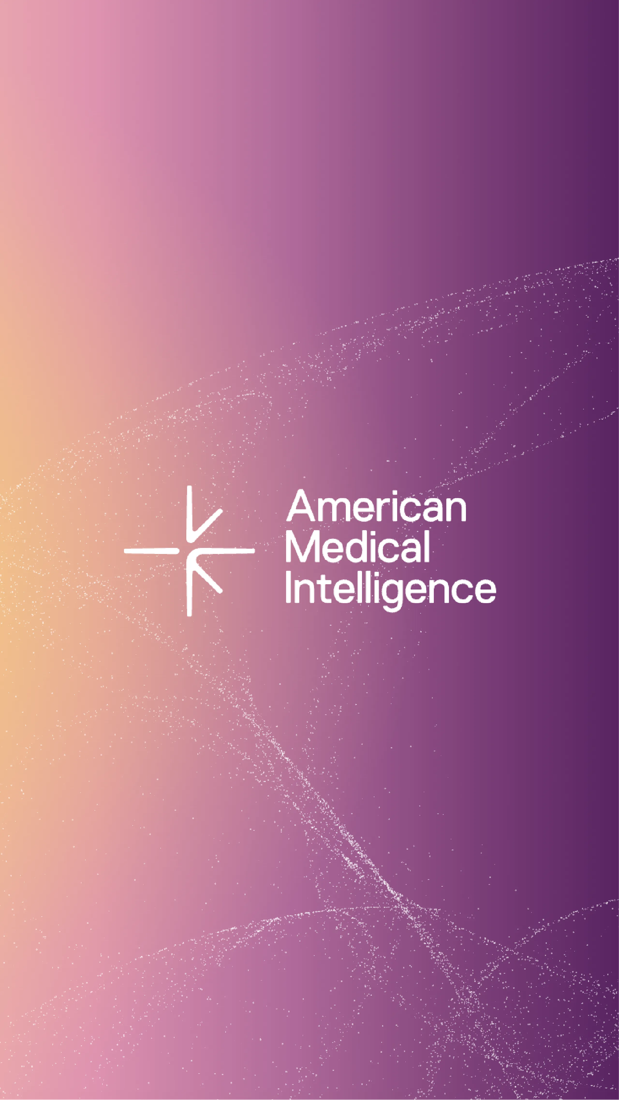
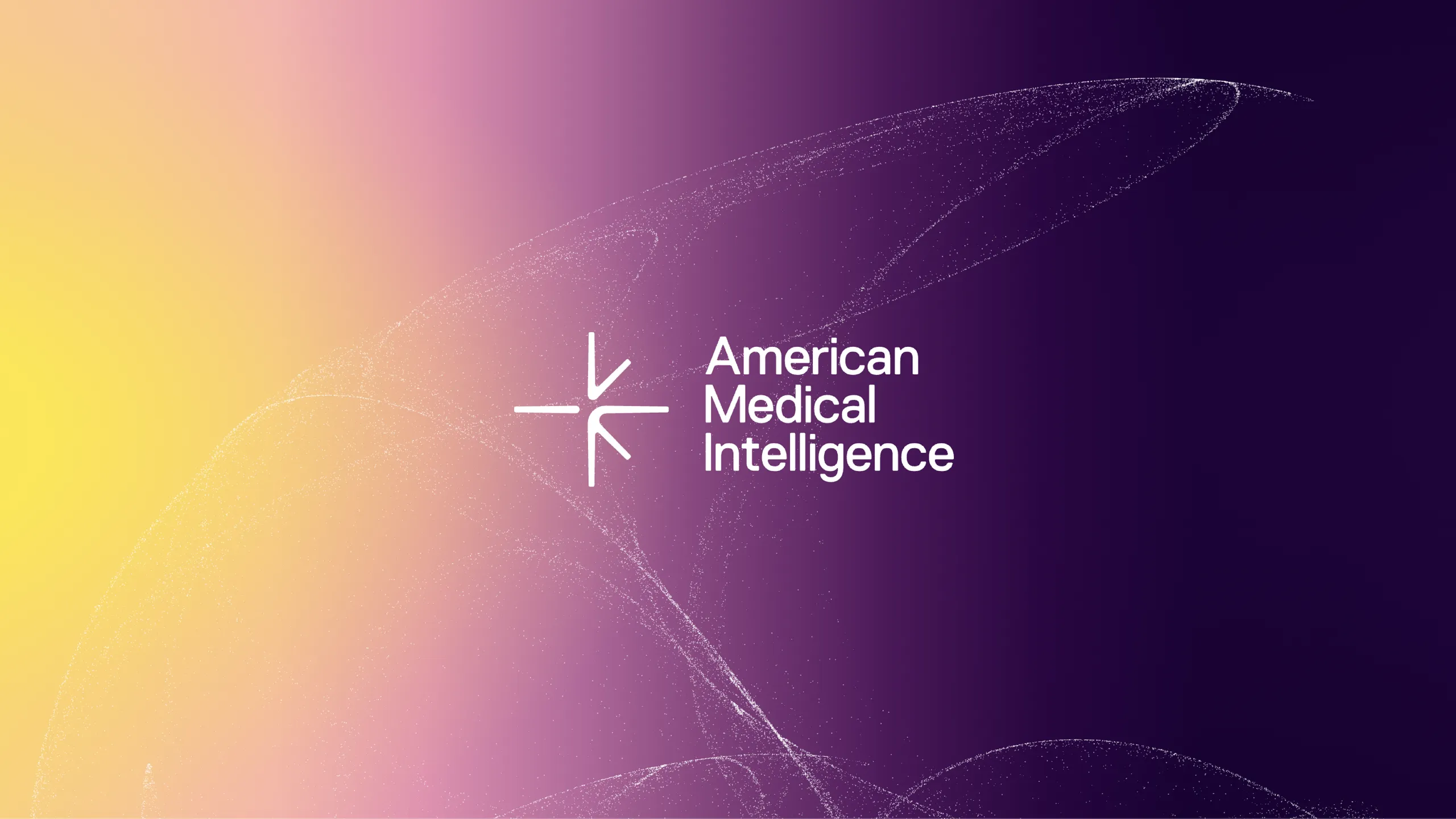
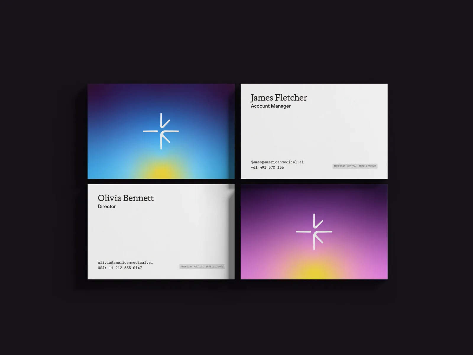
Inspired by the fungal networks behind our strategy, we designed AMI’s logo as a simple starburst of straight lines, with the letters A, M and I hidden among them. Next to the mark, the name is spelled out in full in a clean typeface, so nothing distracts from what AMI is asking of people: to trust it with their health. In tighter spaces, the star works alone as an app icon or sits within a shortened AMI lockup.

HEALTH IN EVERY SHADE
Visible light is made of many wavelengths, from the short, tight waves of violet to the long, loose waves of red. We divided that spectrum into five bands, one for each of AMI’s pillars of health: exercise, nutrition, sleep, sunlight and supplements. Each band became its own soft, shifting gradient, with colour that feels as much like technology as it does like daylight. And because the whole palette is built from light, it leads straight back to AMI’s star.
CODE IN MOTION
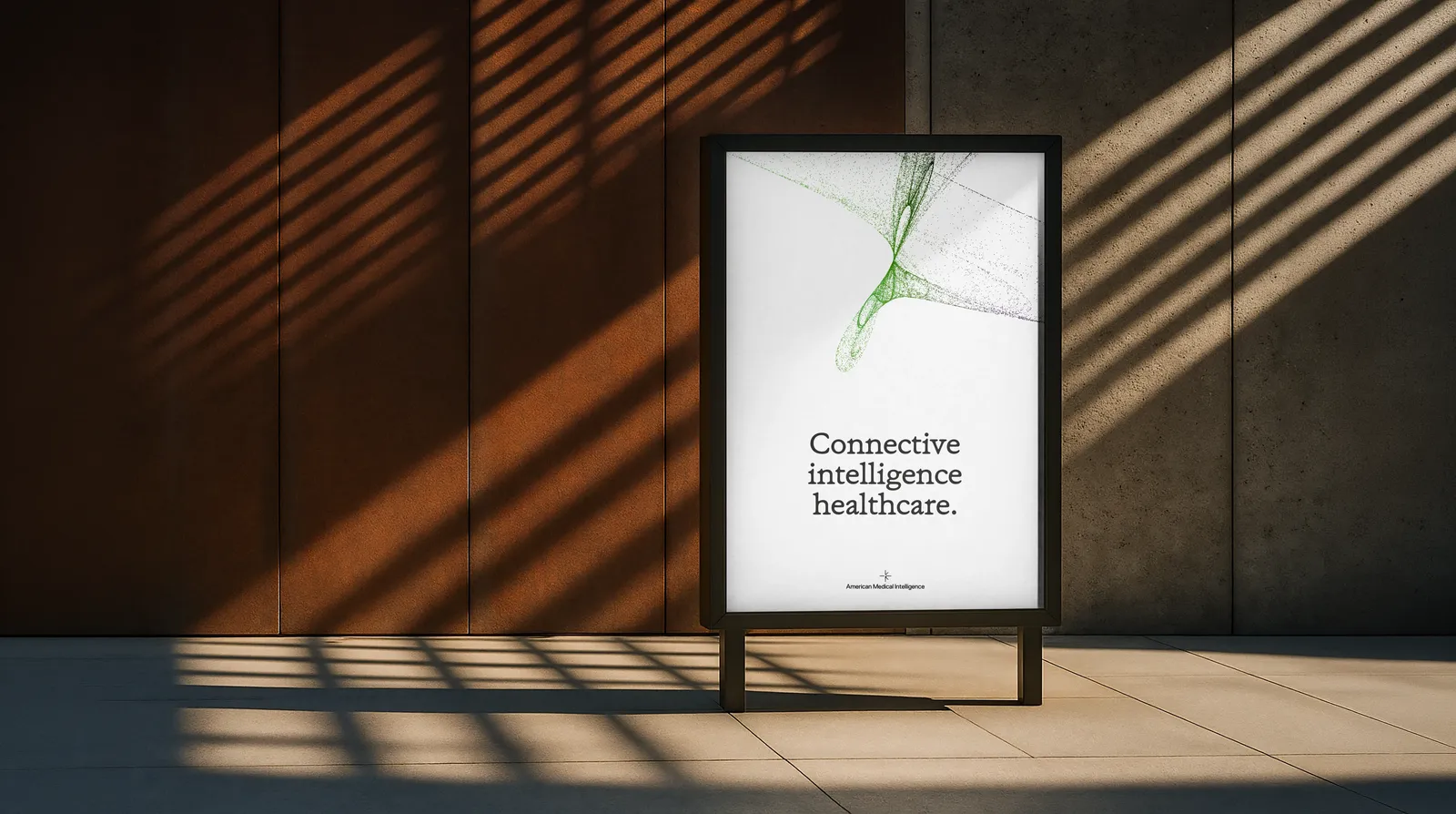
Our design team studied how generative artists use code to move particles, then reworked it so the dots behave like a murmuration of birds, gathering and spreading apart as one. It gives AMI a way to show its intelligence at work that feels organic and easy on the eye. We call them murmurations, and built them at huge scale, so every crop creates a new composition, offering an almost endless supply, much like the knowledge its AI draws on.
DIGITAL BY NATURE
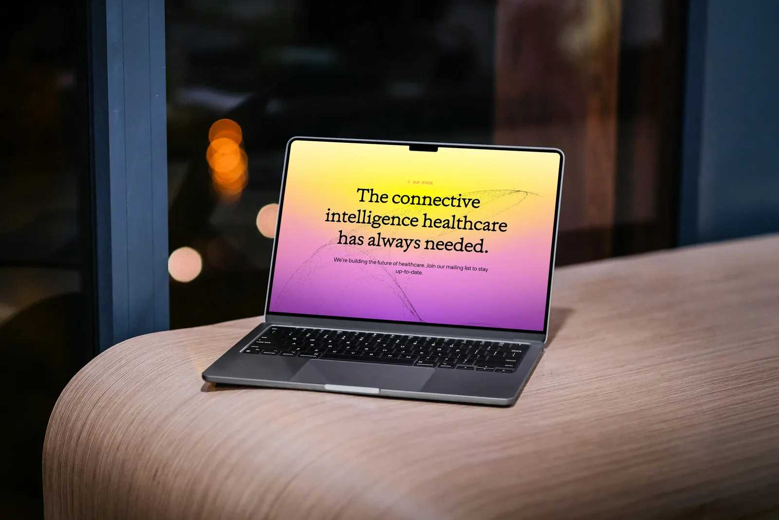
AMI needed a website that could introduce the company to investors ahead of launch. We let the interactions show that AMI is a digital business before the copy says a word. The murmurations follow your cursor across the homepage, and AMI’s story reveals itself as you scroll, so you read along with it. A simple toggle switches between what AMI offers patients and what it offers clinicians, while the gradients sit in the background, coming forward only where a page needs more colour.