BONHAMS
A HOUSE FOR THE CURIOUS.
Brief
Bonhams is one of the world’s leading, oldest and largest auction houses. Their breadth and depth of expertise, items and accessibility are unrivalled, but as a new generation of collectors discovers and buys in new ways, how people see Bonhams needs to move with it. We went back to the nucleus of a collector-collection relationship and built from more than two centuries of heritage, to re-establish Bonhams as the most culturally relevant auctioneer in the world.
deliverables
- Brand strategy
- Visual identity
- Verbal identity
- Digital identity
THE CURIOUS KIND
To be both trusted and relevant, we needed the brand to balance centuries of heritage with an agile and zeitgeist-driven business. Our research made it clear that the repositioned Bonhams had to move at the speed of culture while setting the industry standard. Bonhams enriches lives by bringing people together with objects (and each other) across time and culture, from Old Master paintings to classic cars. That unique breadth of culture and depth of knowledge is what sets Bonhams apart, and it led us to their new positioning, ‘Connecting the curious’.
CENTURIES IN THE MAKING
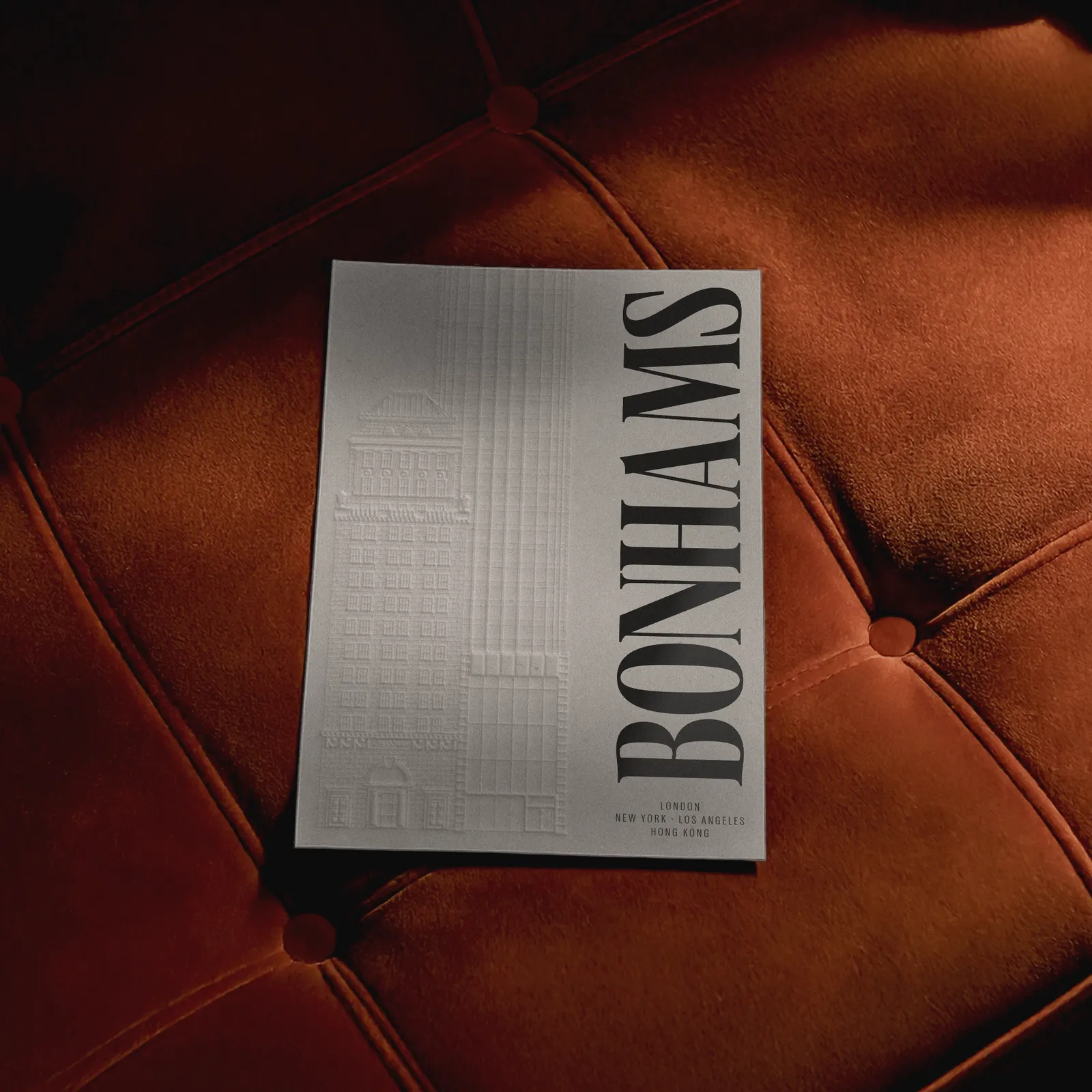
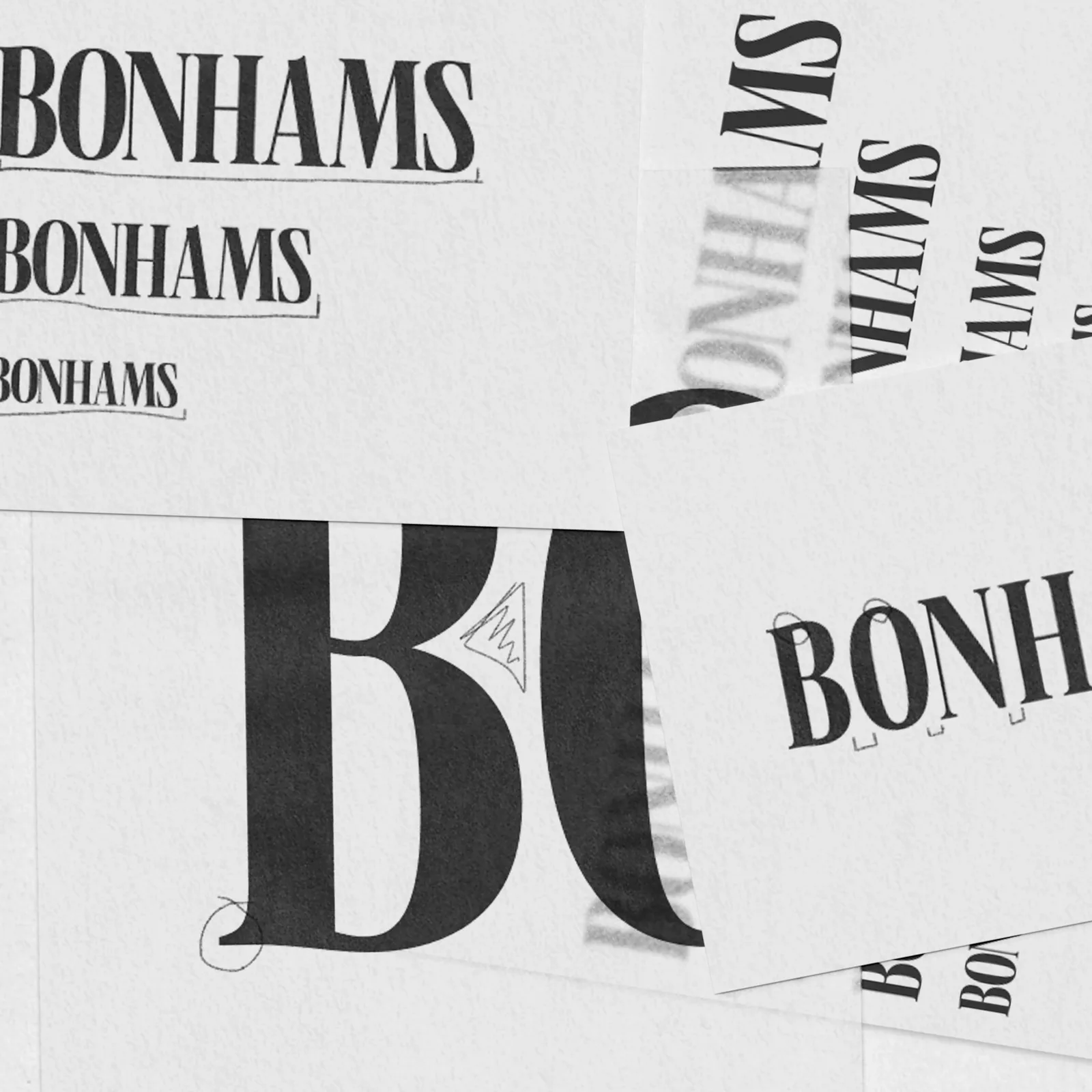
Looking past their previous sans wordmark, we went (much) further back in the brand’s history, to the original Bonhams logo from 1793. Our new serif logotype was inspired by it, carrying that 18th-century character into the way Bonhams shows up today.
Crafted with modern restraint, the logotype’s proportions and detailing were carefully considered for all brand touchpoints and applications. Small refinements to the weight of each stroke and the spacing between letters keep it clear at any size, from a catalogue cover to a phone screen, while reinforcing the brand’s character.
PILLARS AND PLINTHS
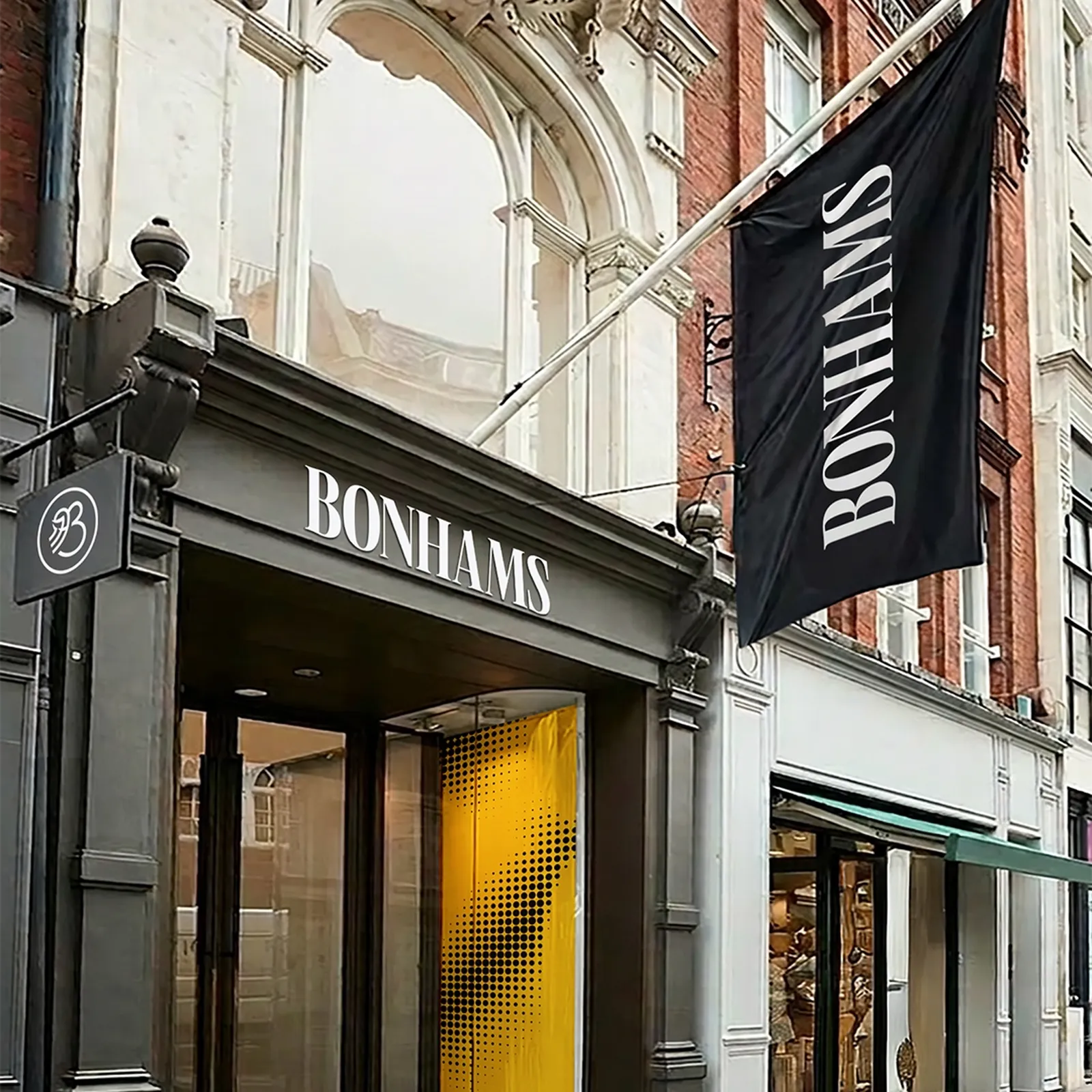
Bonhams has a global network spanning multiple markets, categories and department pillars, from Motor Cars to Jewellery. For clarity, consistency and flexibility across each of these, we developed a logo lock-up system for each brand application across the architecture. Each lock-up is carefully structured to preserve the brand while allowing it to adapt seamlessly to any format or context.
A MARK OF QUALITY
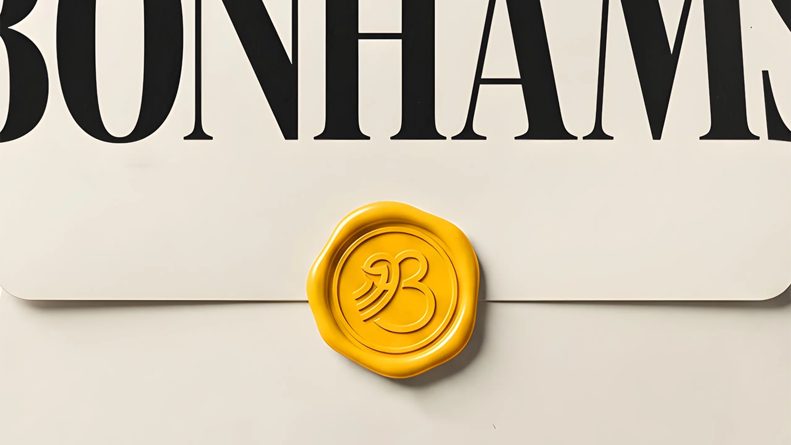
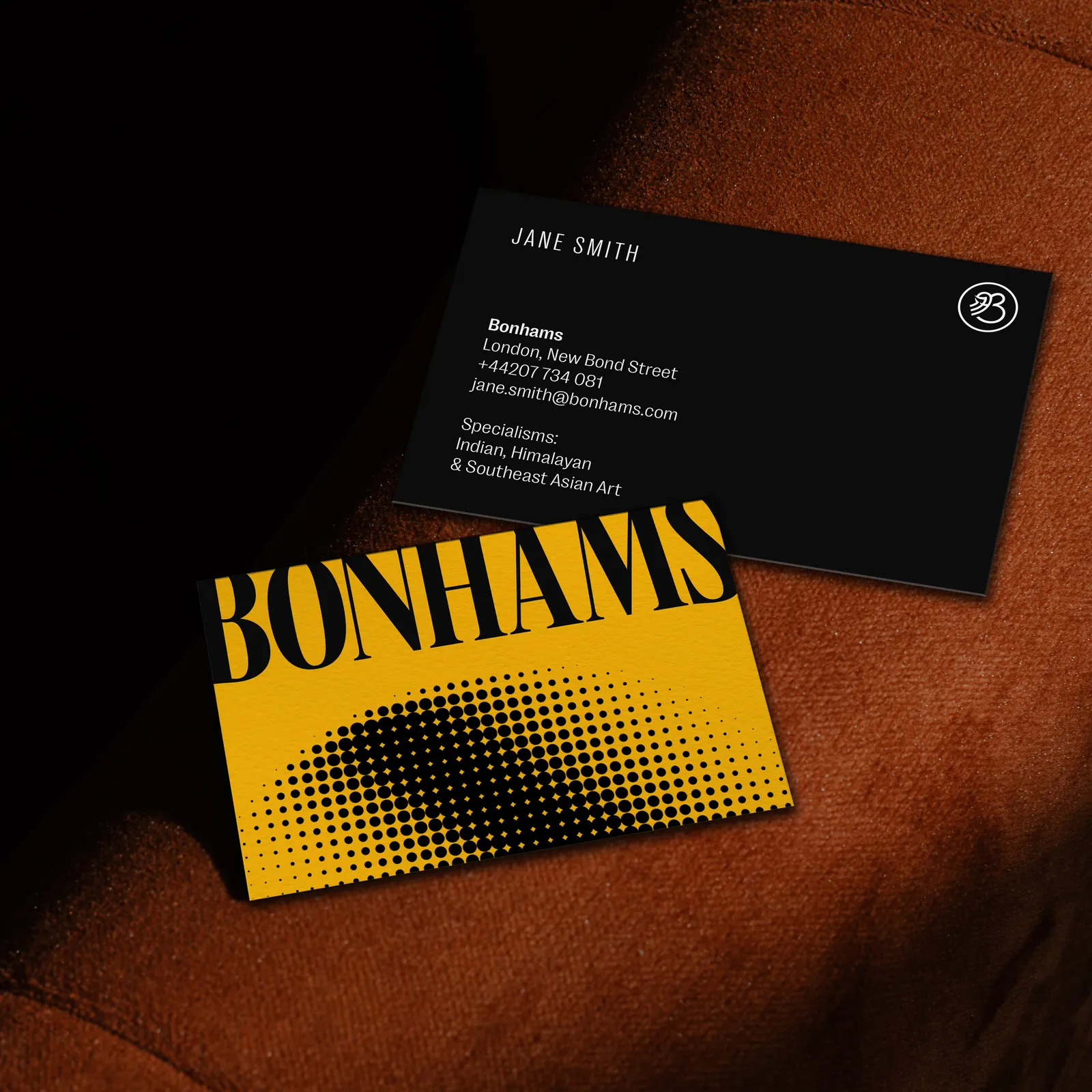
Designed for occasional use where the full logo would be impractical, the Bonhams brand monogram distils the identity, combining the ‘B’ of Bonhams with their established date, 1793. As well as smaller applications, like a digital favicon, app and social media profile images, the monogram is also ideal for when specific communications need a light-touch supporting decorative element.
EDITORIAL CONNECTIONS
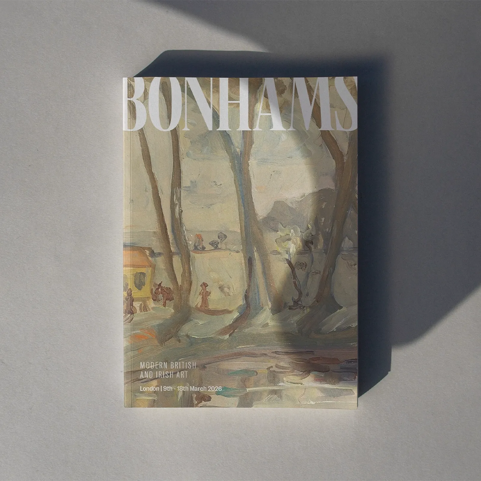
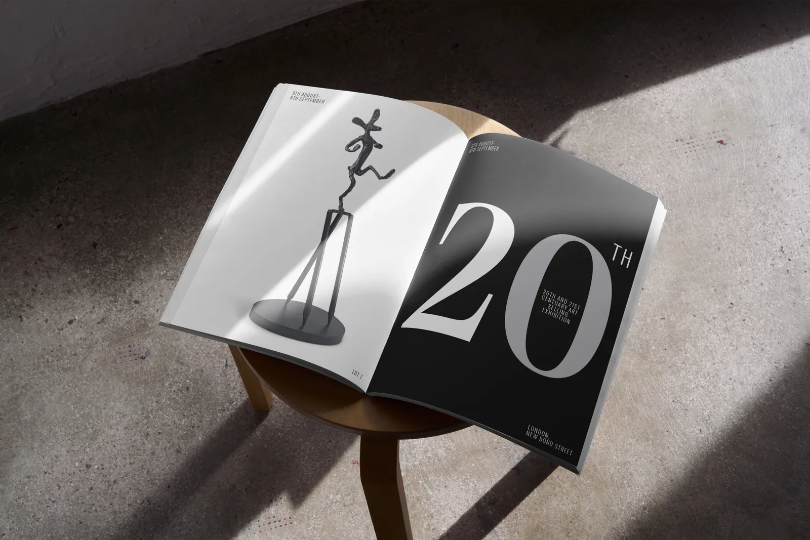
We pulled inspiration from the original Bonhams sales flyers to select our primary typeface, so that it’s not only classically elegant, but undeniably Bonhams, drawn from their own story, history and heritage, while reflecting their modern character.
We use the logo as a masthead, which sets up a custom grid formed of seven columns, drawn from the seven letters in the Bonhams logo, and then using multiples of seven for flexibility where needed.

B IS FOR BONHAMS
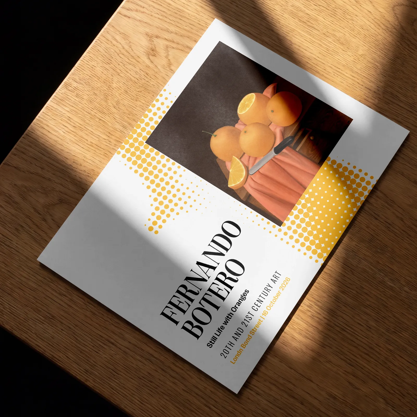
The halftone brand pattern is derived directly from a treated ‘B’ from the wordmark, transforming a core brand element into a flexible visual device. Every dot in the pattern is intended to represent an object at Bonhams, from a first edition to a vintage Ferrari, showing the sheer range of what the house sells. The addition of the pattern to our brand arsenal allows us to add texture, use it as a versatile supporting graphic element, treat imagery, and to add a contemporary (branded) touch in applications where imagery isn’t possible.
JOINING THE DOTS
In film, the halftone’s dots break loose and gather back into the Bonhams logo. Every dot is one of the objects Bonhams sells, and bringing them together shows how, for example, a NASA spacesuit and a diamond ring, far apart as they are, can belong under the same roof. On screen, it gives Bonhams a movement that’s unmistakably its own across idents and typography.

THE DIGITAL EDITION
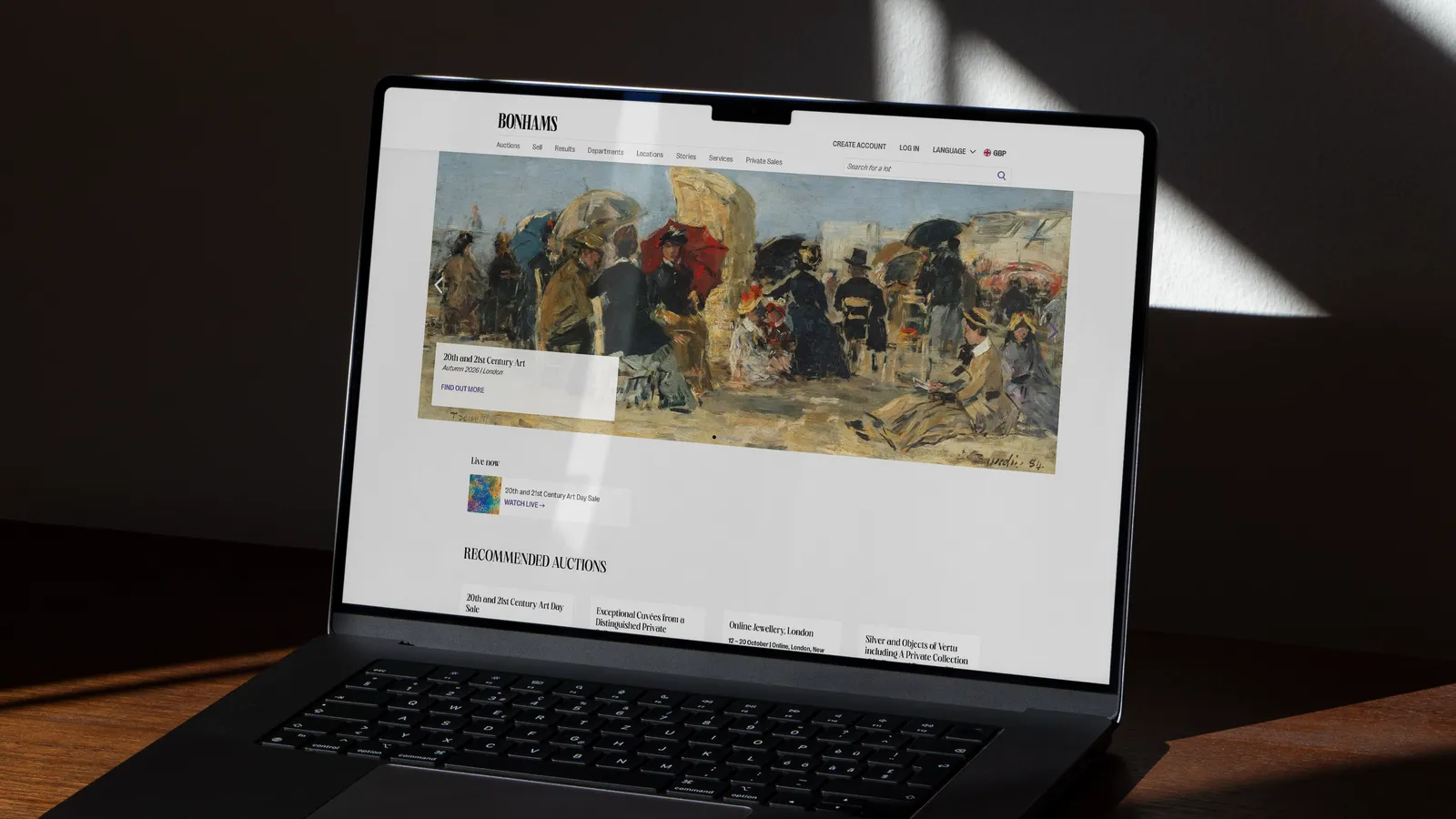
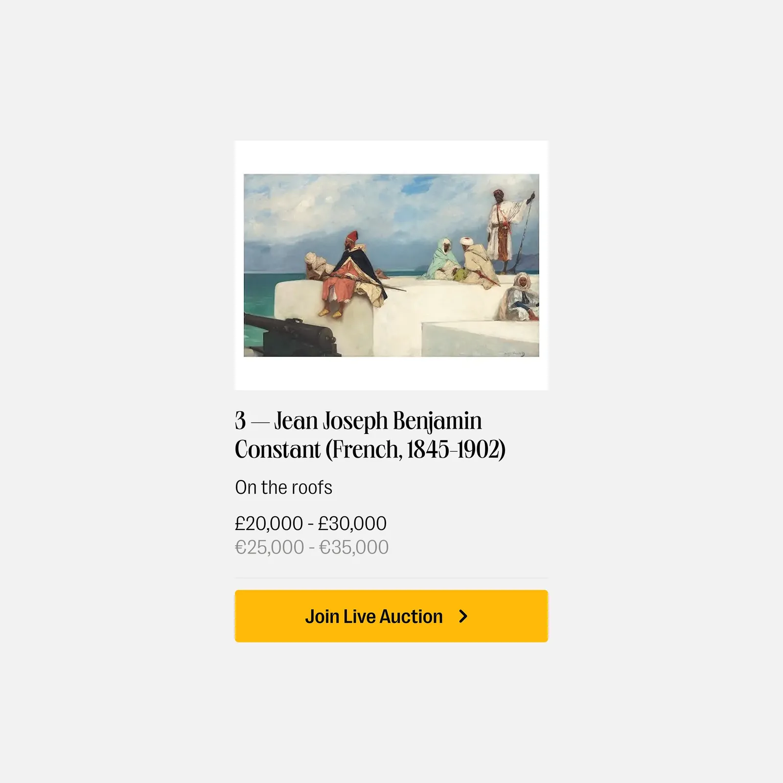
Bonhams builds and runs its website in-house, so rather than redesign it, we gave their team what they needed to bring the new brand online themselves. That meant clear guidance on how the logo works at small sizes, how the typefaces organise a page, and how colour stays accessible on any screen. The result is a website that feels as considered as a Bonhams catalogue, built and kept that way by their own team.
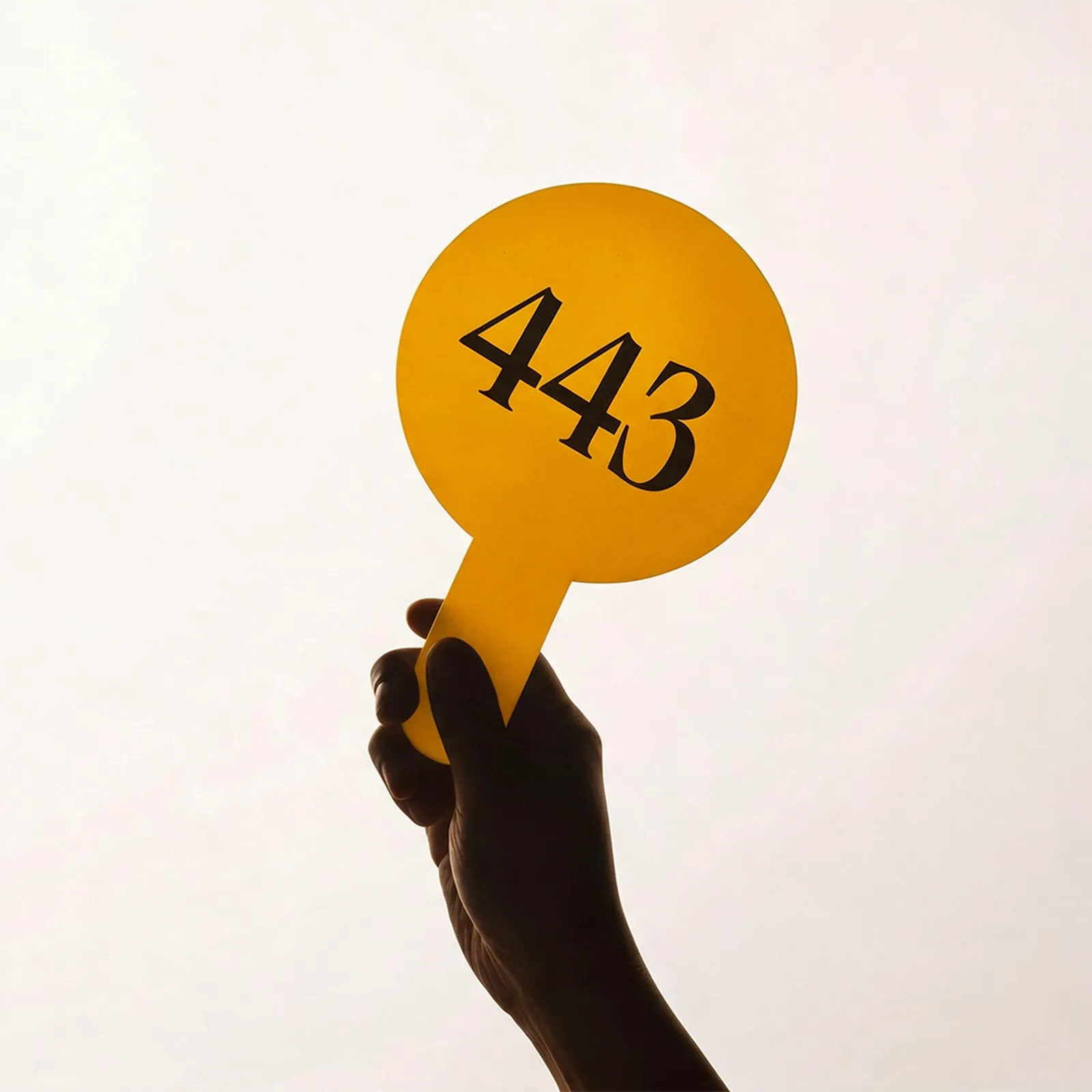
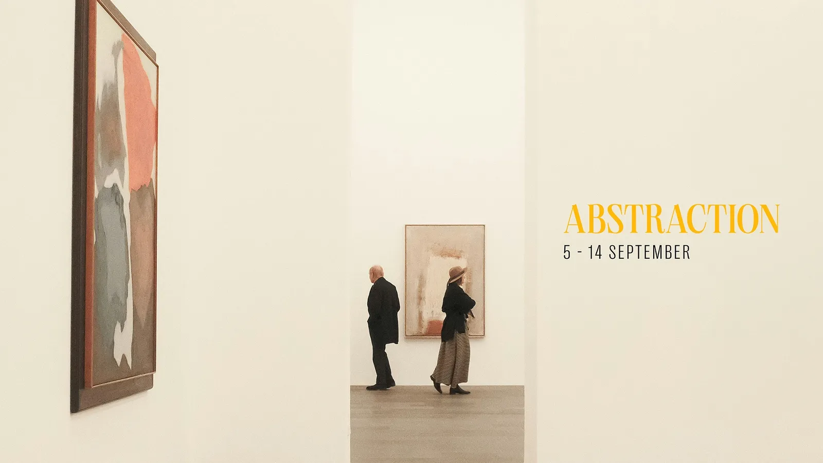
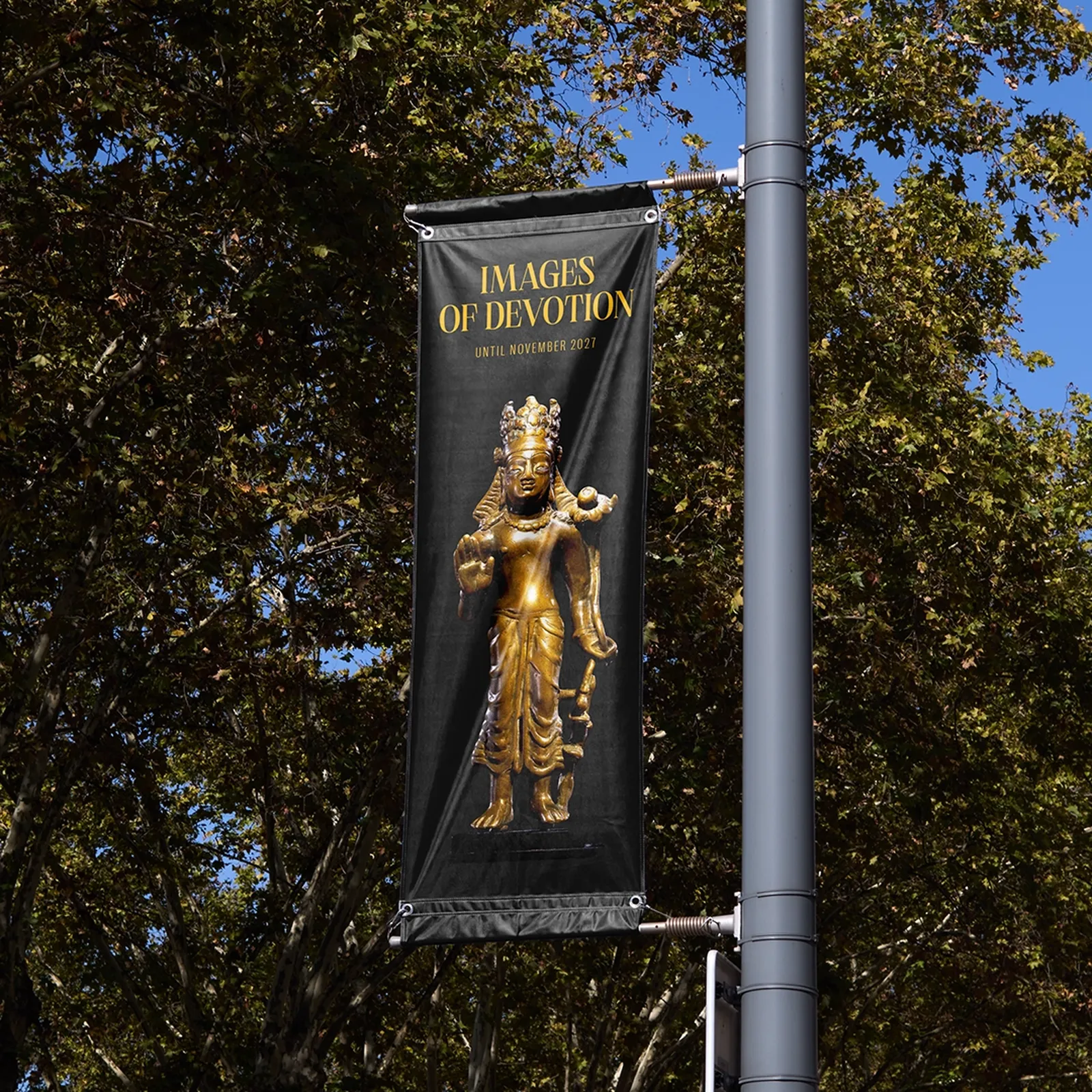
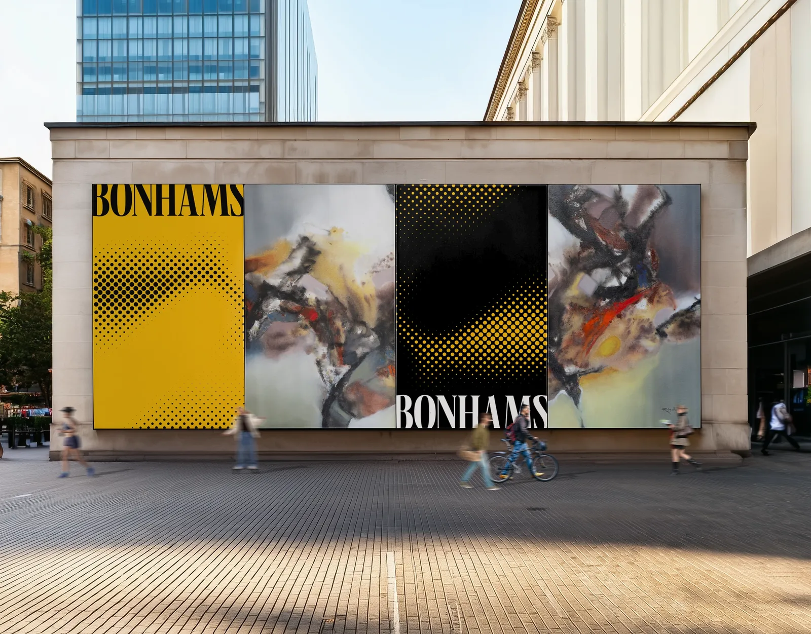
OPENING THE DOORS
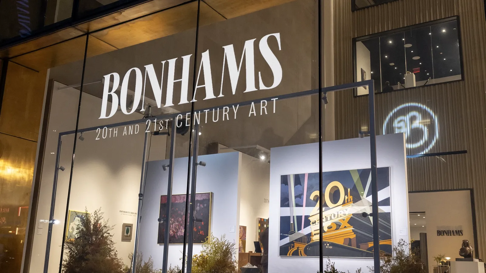
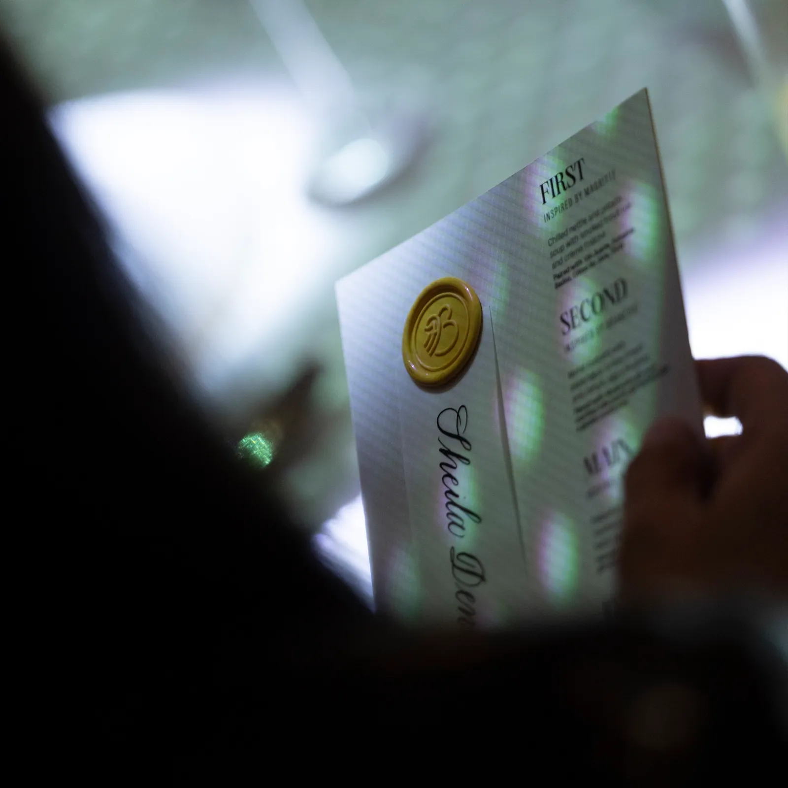
When Bonhams opened its new New York headquarters on West 57th Street, it was the world’s first look at the new brand, so we gave it a proper entrance. We designed the invitations, created the motion pieces playing on screens throughout the building, and worked with partner agencies on the ideas behind the event, from its themes to the guest list. Inside, we carried the identity into every detail, down to the new typeface on the plaque beside each artwork. And the night’s headline idea came from us: for the VIP dinner, attended by Alicia Keys and Swizz Beatz, we dreamt up projection-mapping the artworks onto the dinner table, then brought in specialist partners to make it happen.