
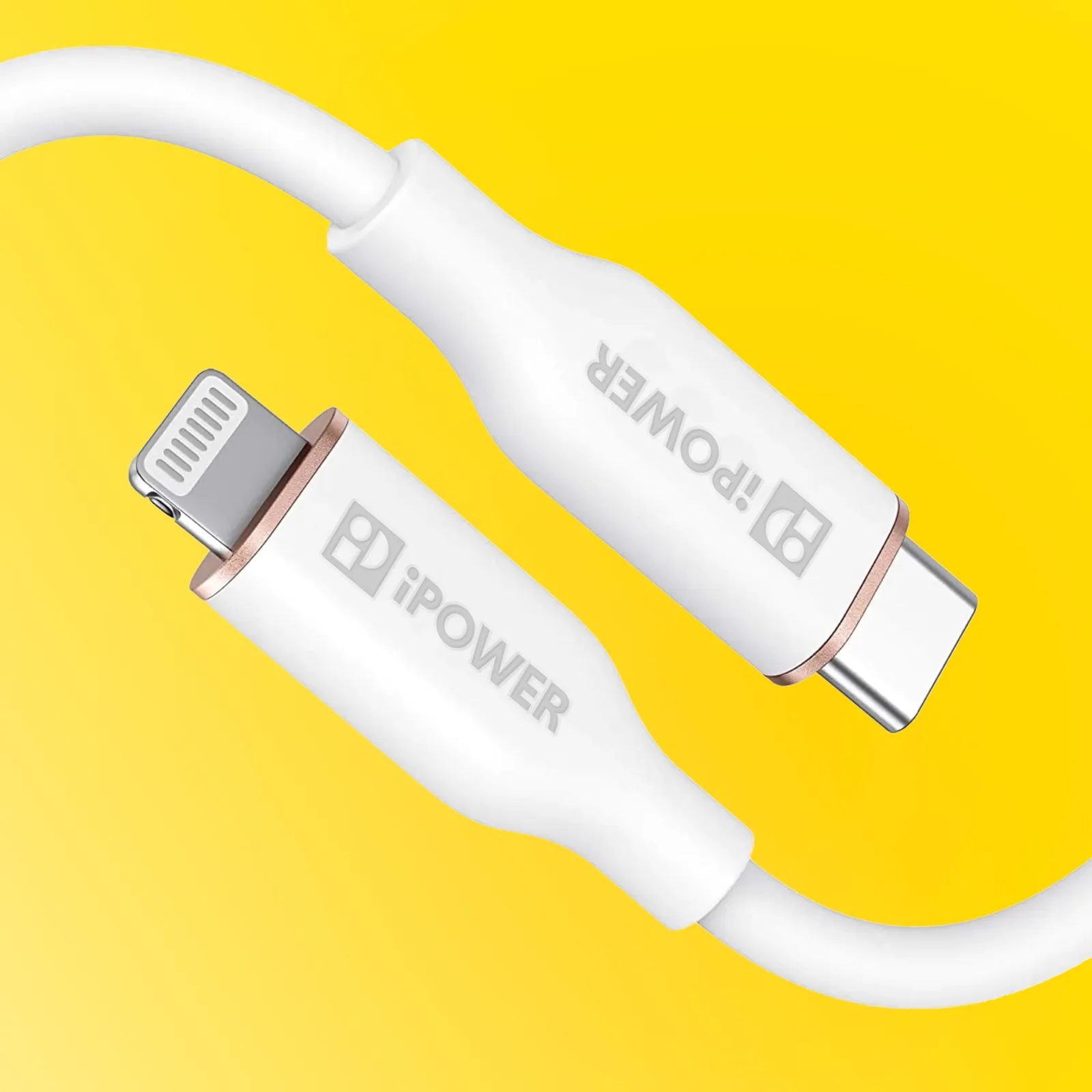
iPower
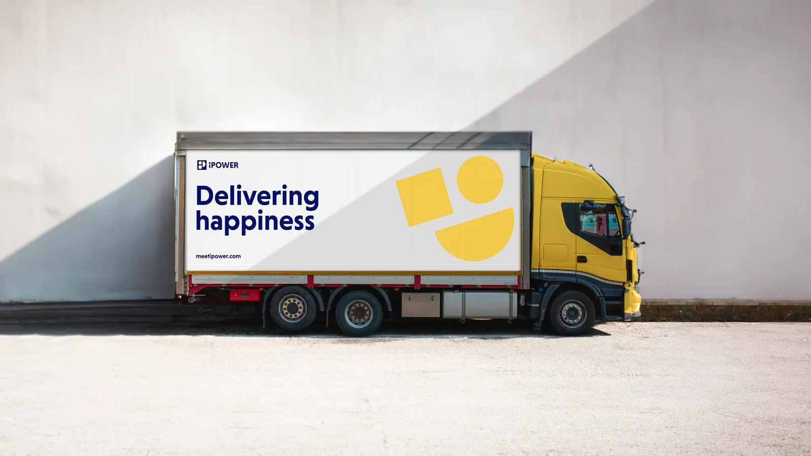
DELIVERING HAPPINESS.
Brief
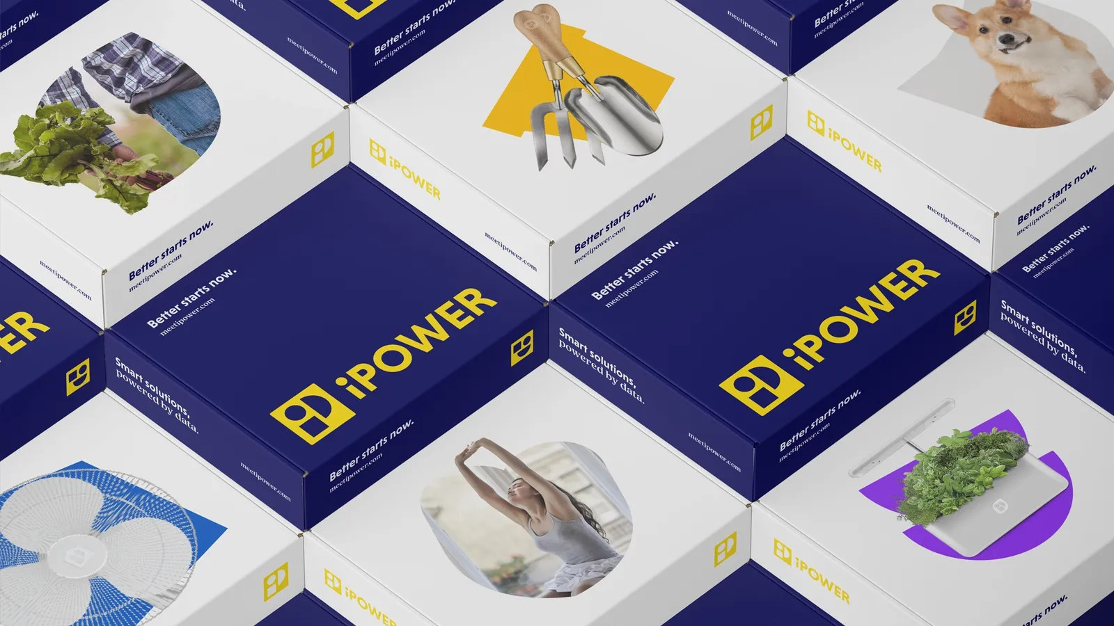
Made up of a versatile range of business lines, iPower are specialists in both day-to-day consumer products and efficiency-boosting business services. And with an astute focus on finding value wherever possible, their philosophy is simple: make our customers’ lives better, every day — a vision we were excited to bring to life across their brand identity.
deliverables
- Brand strategy
- Visual identity
- Verbal identity
- Website
BEING HELPFUL MAKES US HAPPY
iPower’s mission is underpinned by three core values: A belief that data and process informs the best decision making (intelligence). The prioritisation of good, honest business that helps customers feel assured (integrity). And a commitment to delighting customers, going one step further to hope to raise a smile (impress). Together, we set out to turn these values into a reality, to build a brand that brightens people’s day.
SERVICE WITH A SMILE
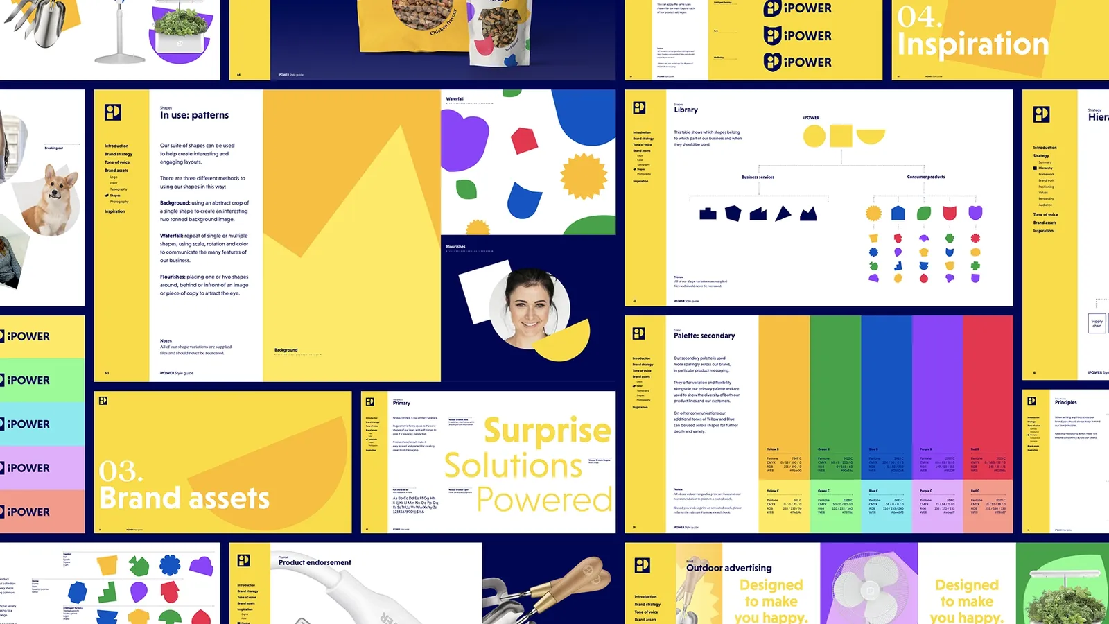
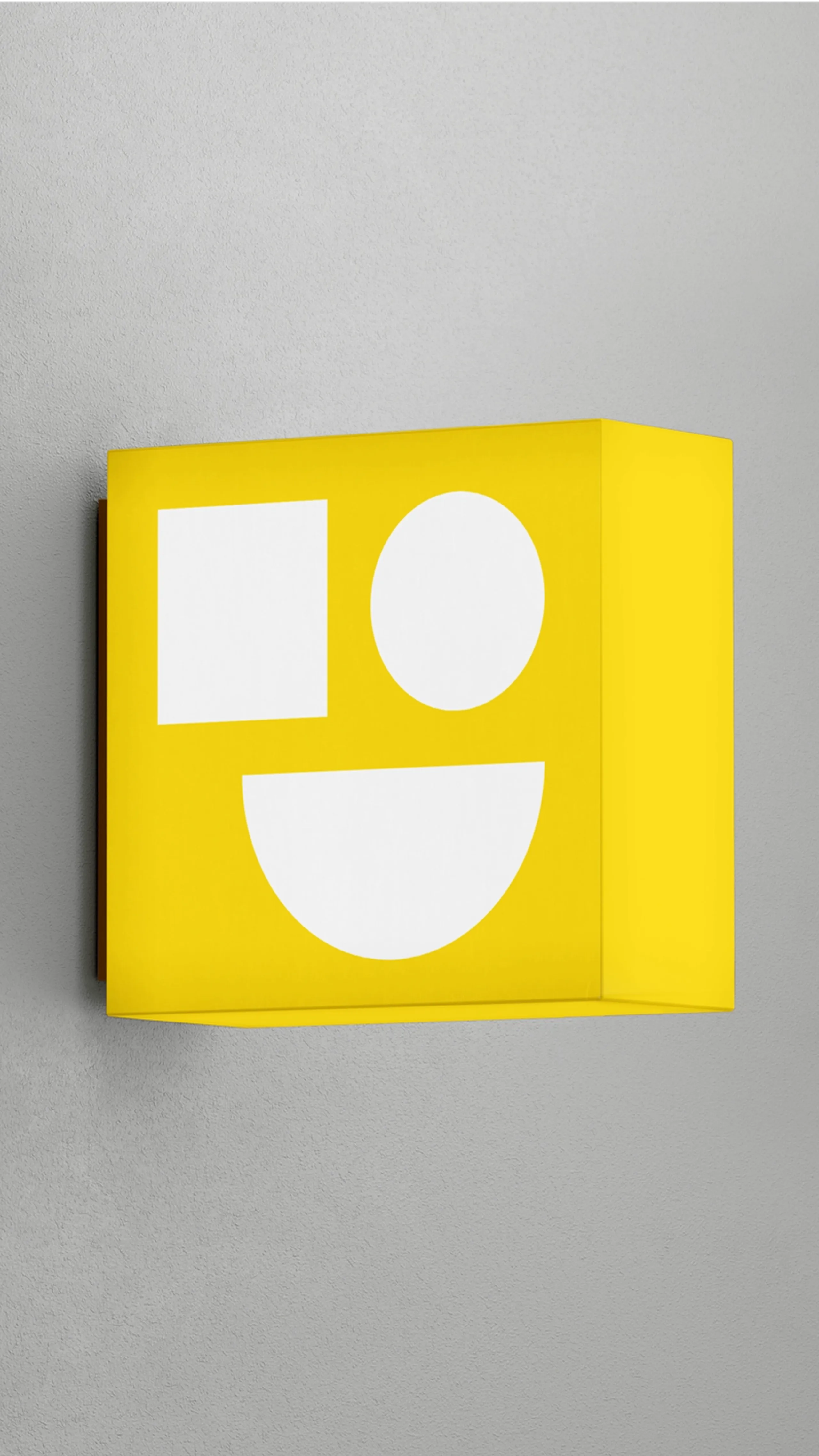
With countless consumer products launched each year, their logo needed to be clear, smart and easily etched on to a 250ml house-plant mister. So we kept it simple. Three primary shapes, brought together in a symbol that quite literally forms a smile (in the mind).
VARIETY IS THE SPICE OF LIFE
The visual identity celebrates unbounded variety, reflecting a business that touches all aspects of business operations and home comforts. We designed a flexible, modular system that adapts to each product and service, creating a library of shapes and compositions that blend function with charm. They’re woven into every part of the experience, from practical cues in the digital product, to vibrant storytelling in communications.