
LEMON APPEAL
LIFE GAVE US LEMONS.
Brief
Two lemon-obsessed founders came to us with a mission, an irrepressible energy and a simple idea. To partner with southern Italy’s finest producers, growers and artisans to celebrate, protect and share their crafts. As the artisanal traditions of heroic lemon farming, weaving and ceramics have been passed down through generations, they have become at risk of dying out. We were lucky enough to partner with the mother-daughter duo on realising their beautiful dream of a brand that celebrates and gives platform to the unique sensibilities of southern Italy.
deliverables
- Brand strategy
- Naming
- Visual identity
- Verbal identity
- Digital identity
- E-commerce website
- Photography & Videography
FERTILISING FUTURE GROWTH
When we started working with the, then un-named, Lemon Appeal they knew that they loved Sfusato lemons and wanted to celebrate them, but didn’t know exactly how they were going to do that. We needed the strategy work to identify their audiences and investor opportunities, while solidifying their goals and exploring all of the different places the brand could potentially show up.
As we were laying the foundations for an exponentially expanding and diverse business, we created a flexible suite of multiple logos, ready for whatever category they targeted.
CHILDLIKE WONDER
Mother-daughter founders Anik and Sophie have connected over their love for lemons since Sophie was little, so to communicate that innocent, playful story while staying premium, we created a suite of simple lemon illustrations. We then animated them to look as though they’re being drawn before your eyes, with clean lines and a little flourish.
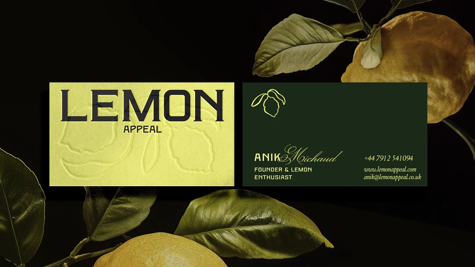
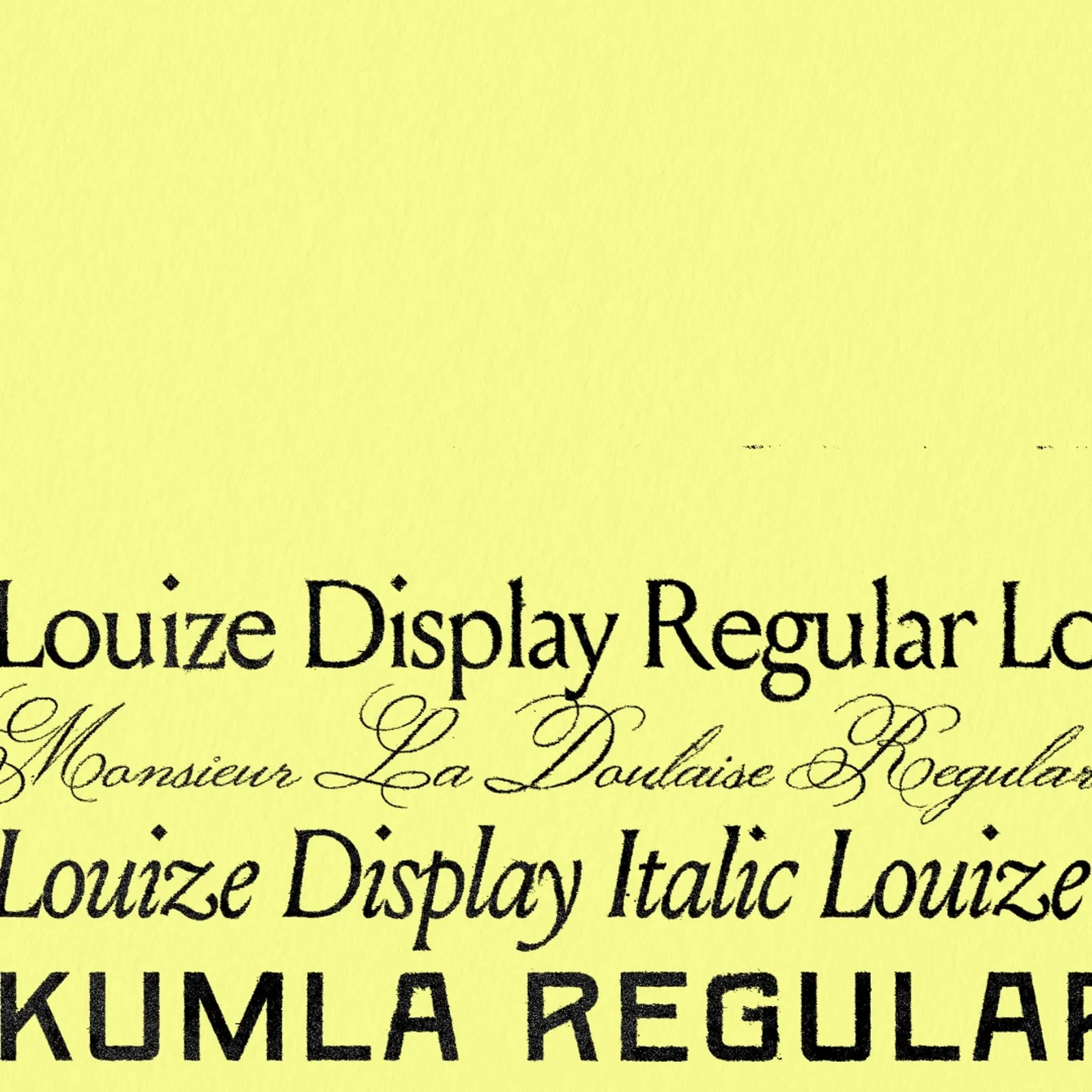
LUSSO MODERNO
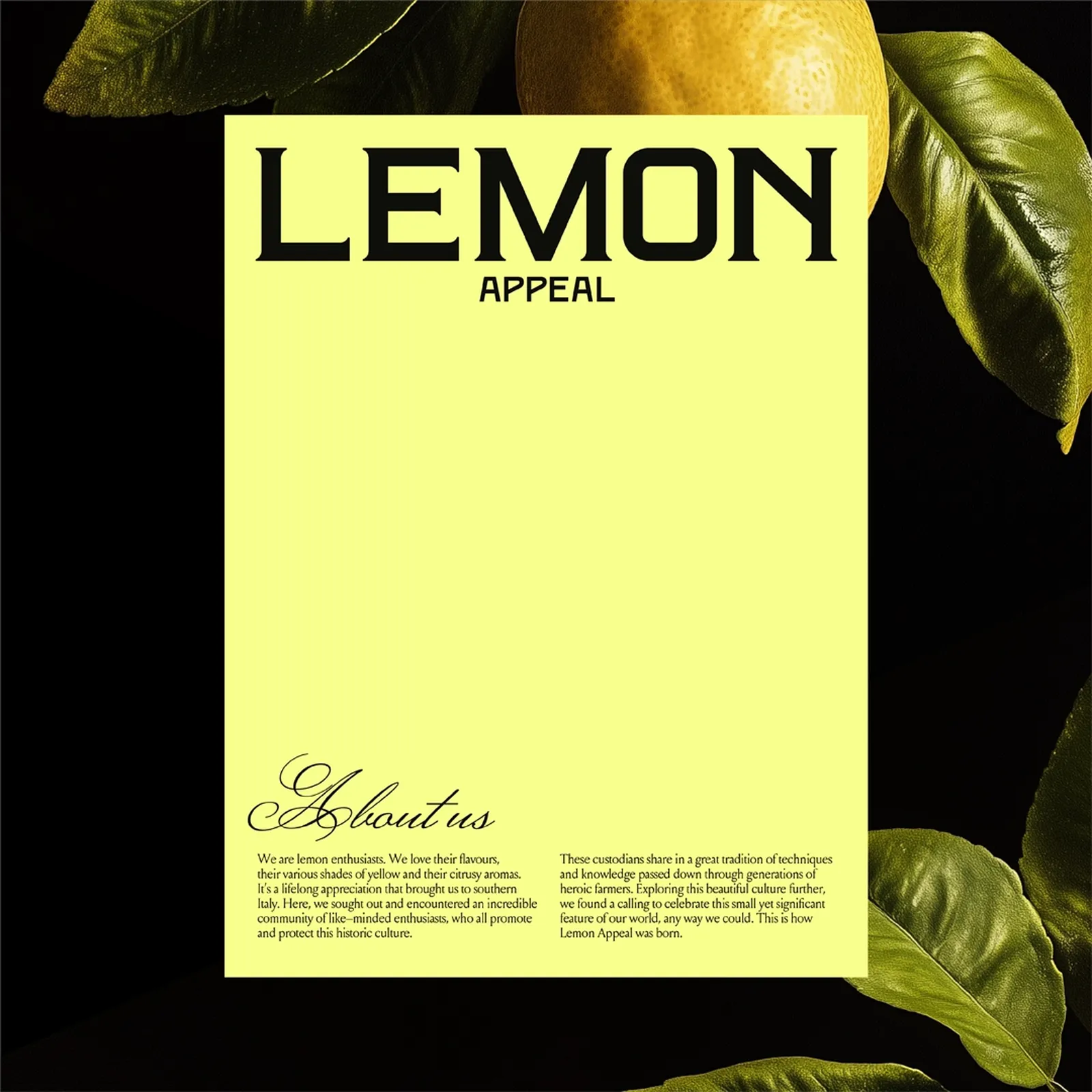
Our type choices blend Italian heritage with modern luxury. We added serifs and utilised vintage, art deco style crossbars in the wordmark that are reminiscent of old Italian signage. While the script type brings flourishing luxury into the titles, the body copy in Louise acts as a modern version of a print-style serif type. When brought together, the combination creates an editorial styling, leaning heavily on print layouts to emphasise the playful but premium modern luxury of the brand.
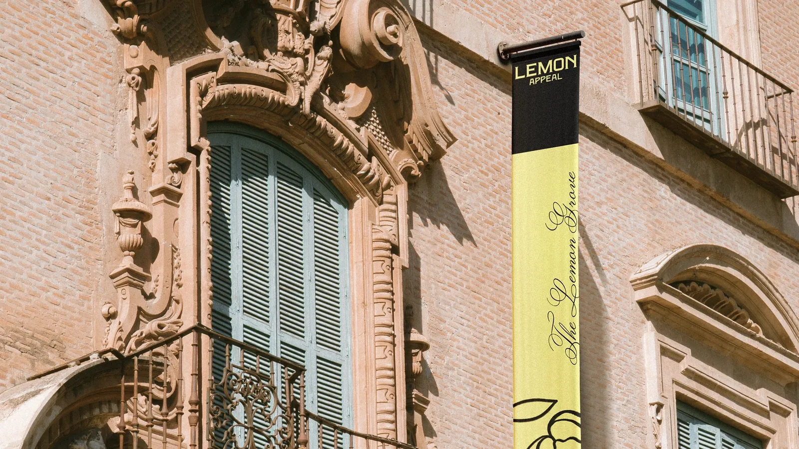
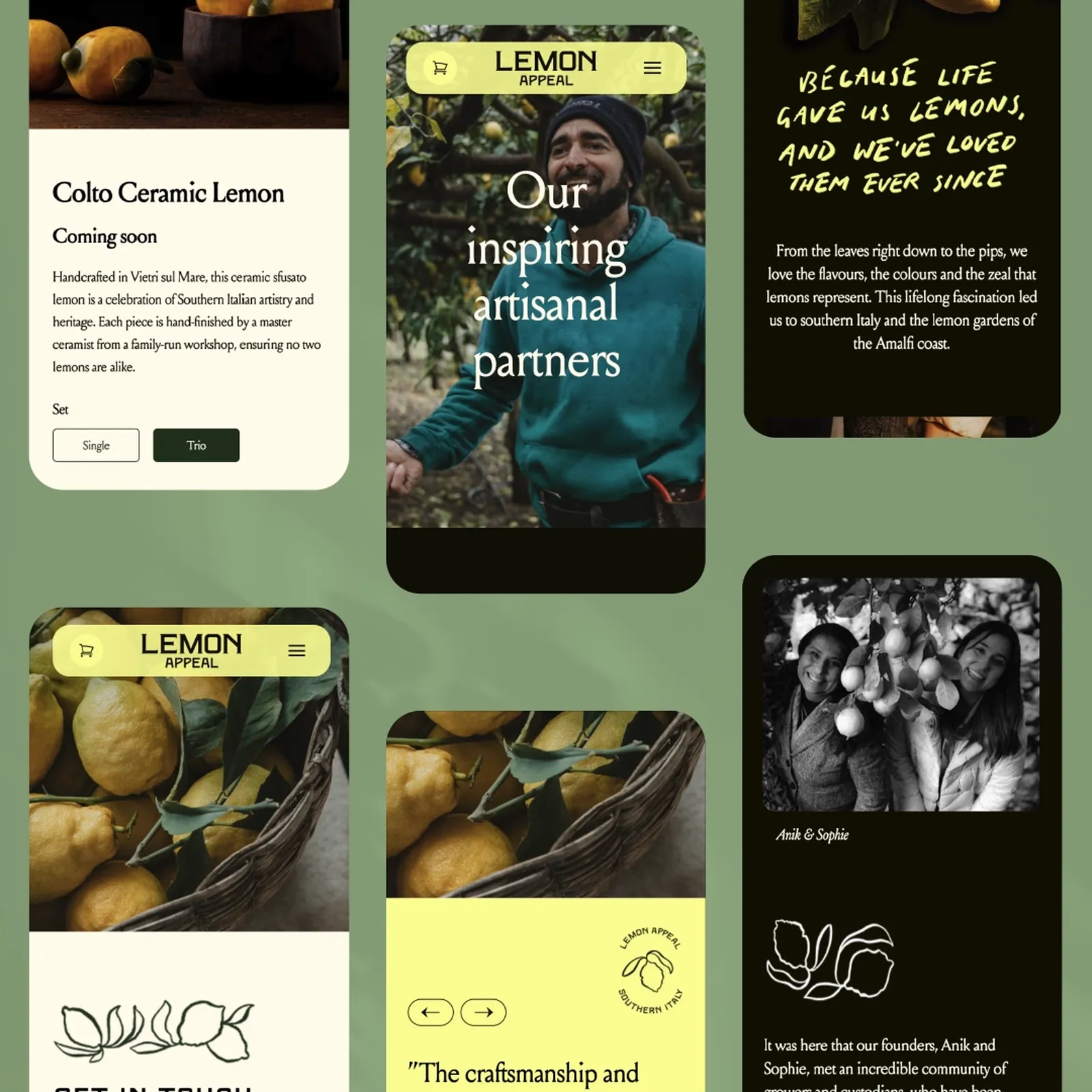
A DIGITAL GROVE
Initially we created a simple one-pager site to get the Lemon Appeal brand out into the world ahead of the launch. The site was then built out into a full e-commerce platform supported by Shopify, helping to tell the story of the brand, the mission, and why southern Italian artisans are so important. But also, as a place where anyone can purchase the unique products made by those artisanal partners. The site go-live was also timed to the day of a (beautiful and delicious) launch evening event.
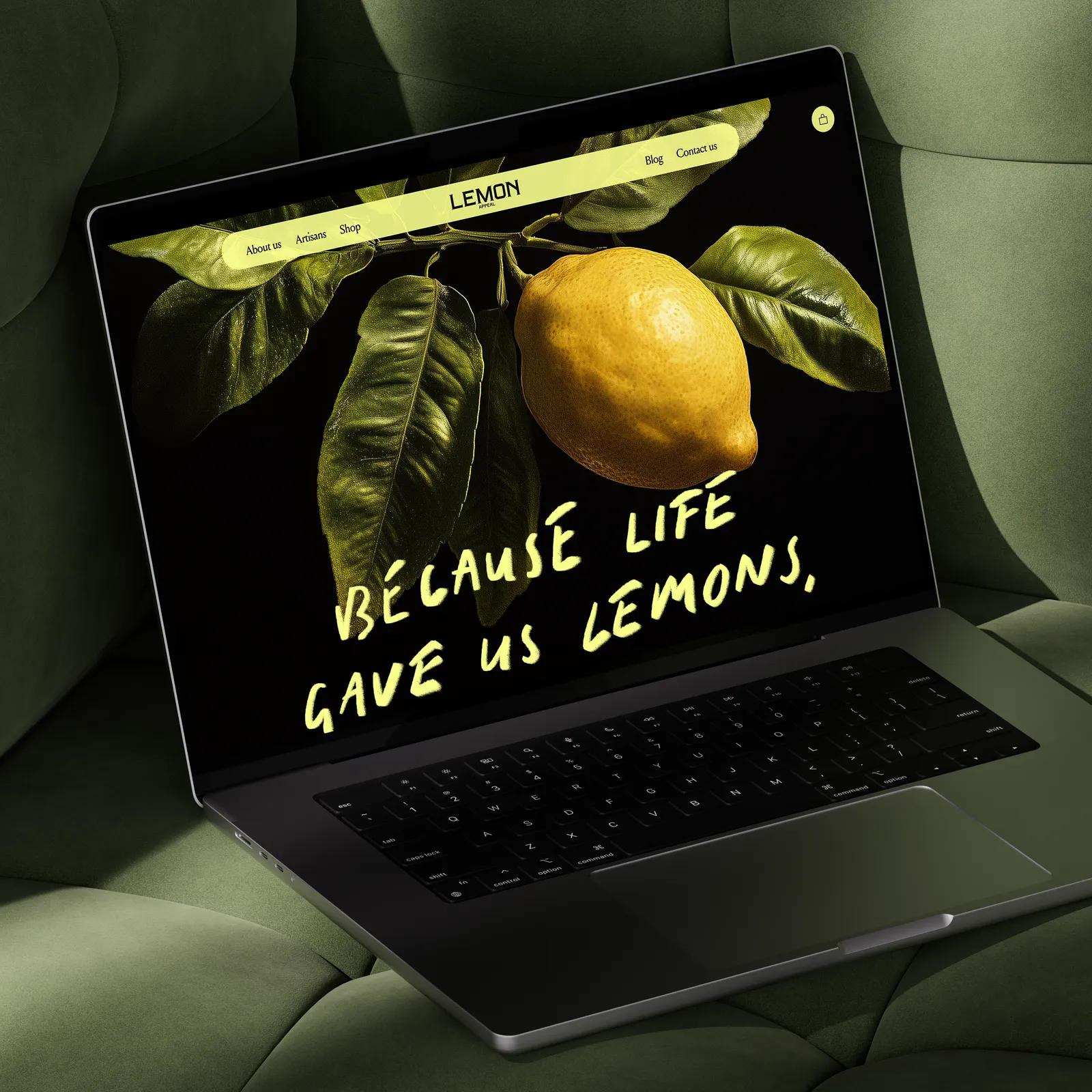
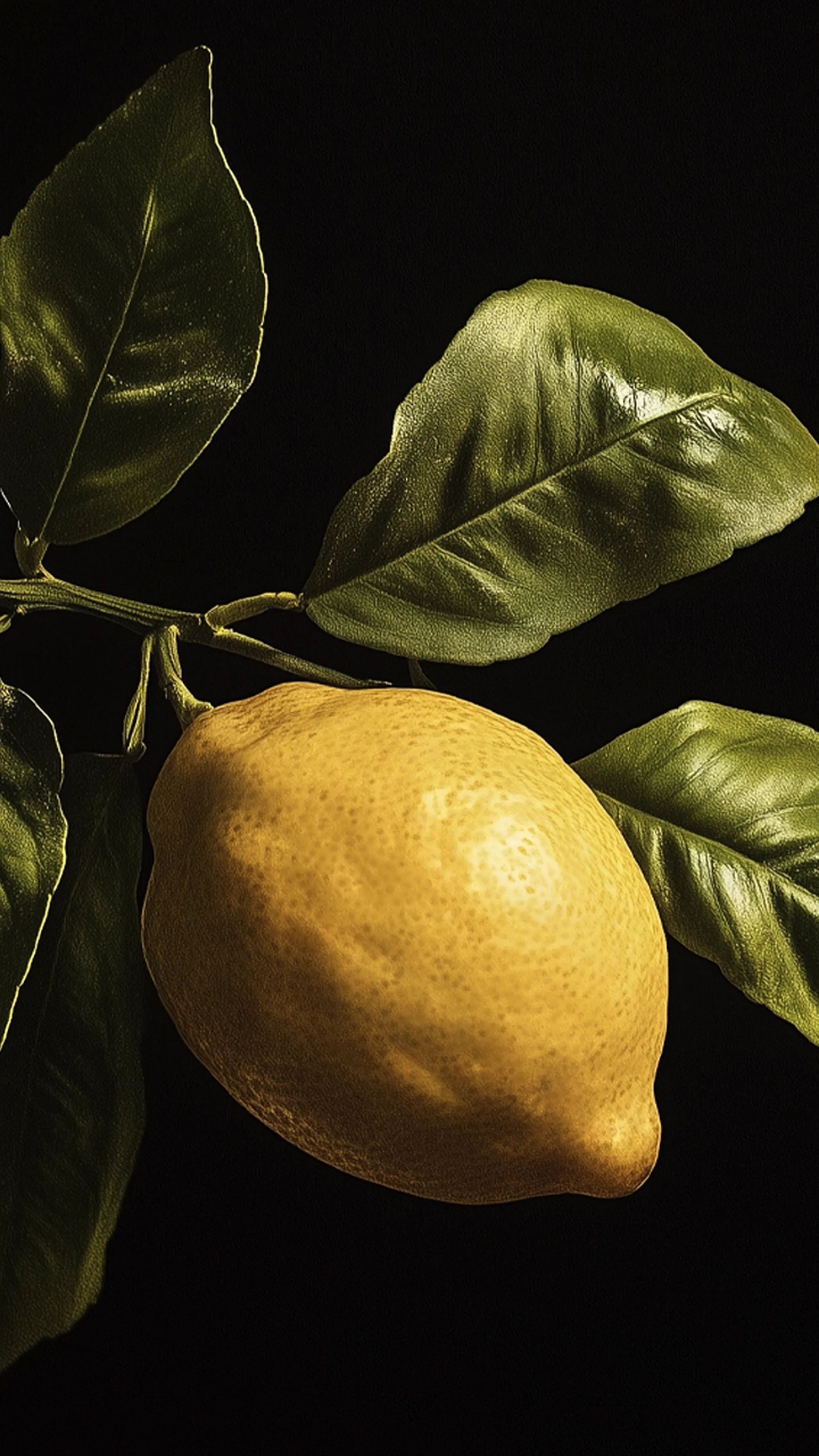
A POSTCARD FROM ITALY
Our hero art direction was designed to celebrate the lemon at every stage of life in its natural(ish) habitat. Set against a black background the imagery is dramatically styled as a renaissance painting, harking back to a pivotal moment in Italian art and culture. As there were no Sfusato lemons ready at the time of year that the first brand assets were created, we used midjourney to ‘shoot’ the initial assets.
The other objective of the art direction was to capture the artisans in their (genuinely) natural habitat and the essence of southern Italy. The team set off to Amalfi with the founders to capture the unique landscape that’s so vital to the lemons’ character and meet their artisanal partners, setting the Heroic farmers within that incredible setting.
All of the assets were directed to create the feeling of a post card from Italy. What message would you want to send your loved one, as you describe how magical this place truly is.

THE JOY OF PURPOSE
Our tone of voice mirrors the founders’ incredible passion and energy. With enthusiasm and a little play we’re able to gently lean towards zesty puns, while remaining fun (not funny) to stay premium. Confidence in the brand mission and proactivity needed to also come through, predominantly in the way we talk about our partners and their importance. And when brought together across some of the first brand touchpoints; advertising, social media etc. we can see the brand is ready for any and all diversification that the Lemon Appeal might evolve into.