
PADIUM
SERVING AN ACE IDENTITY FOR THE UK’S PREMIUM INDOOR PADEL CLUB.
Brief
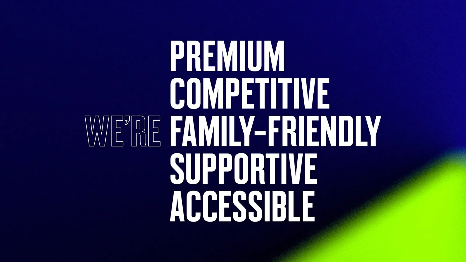
Unlike the rest of Europe, there are very few designated padel clubs in the UK, and those that do exist feel more like (and often belong to) tennis clubs. That needed to change. Padel needed a Wimbledon of its own, a place for its fans. In 2021, two padel enthusiasts set about to change padel’s reputation in the UK. Their vision: to build The UK Home of padel, setting a new standard through accessibility, education, community and premium experiences. We helped bring that vision to life.
deliverables
- Naming
- Brand strategy
- Visual identity
- Verbal identity
- Marketing website
UPPING THE GAME
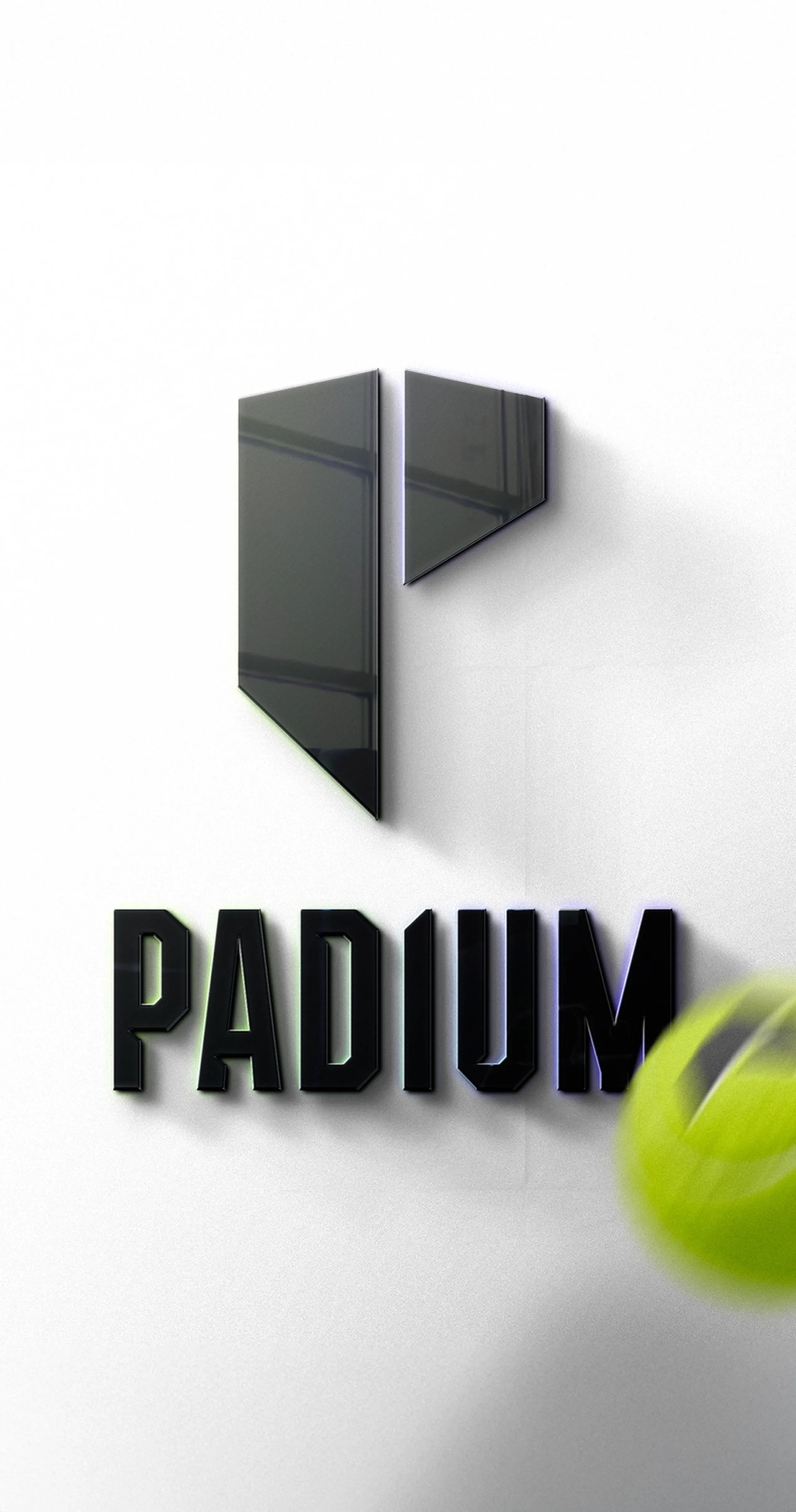
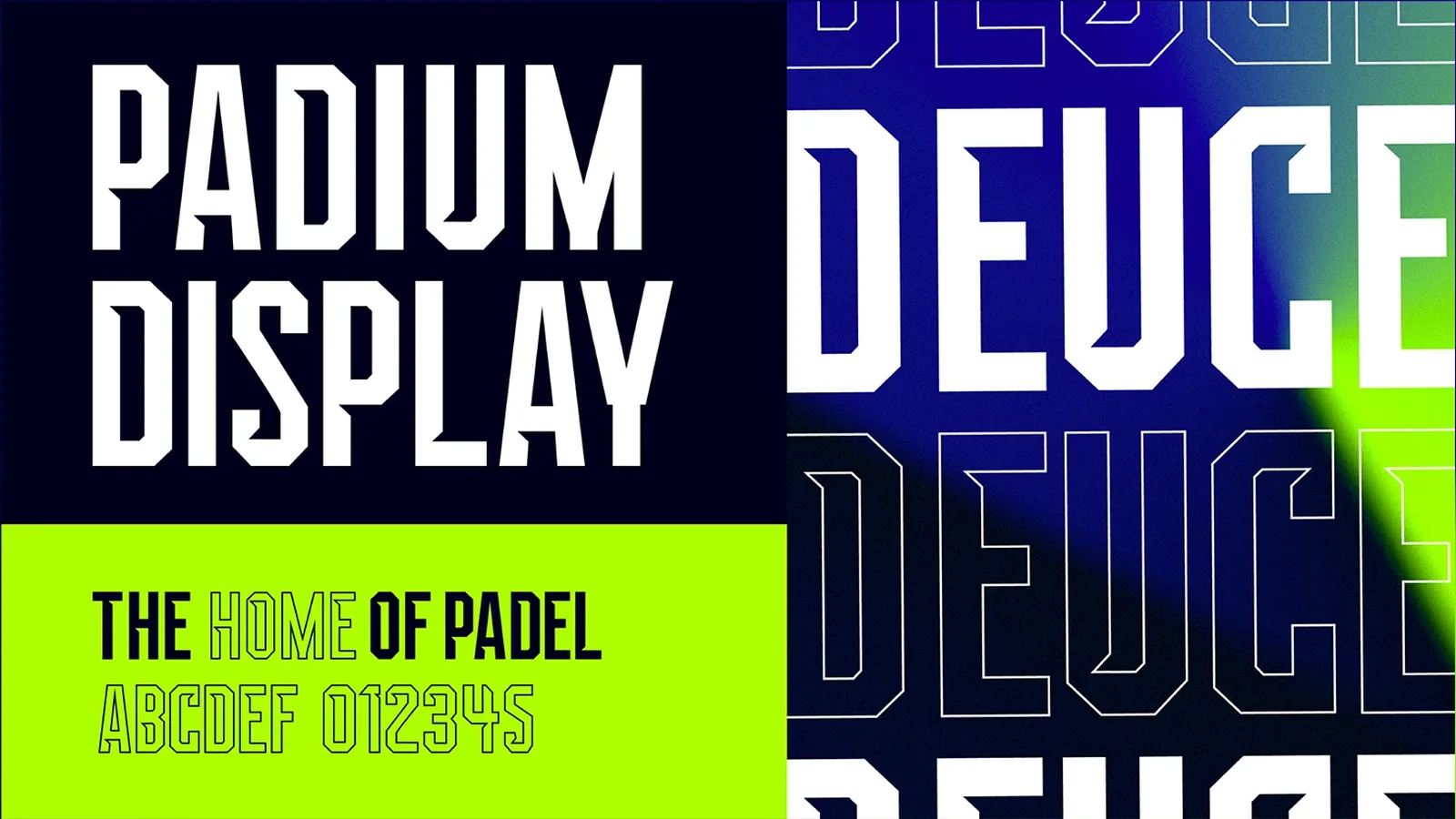
We needed to establish a brand identity that not only represented the sport but also the brand's bold vision. First things first, the name. We knew it needed to feel confident, but with such little awareness it couldn’t be too enigmatic. So we kept it simple: Padel + Stadium. At the heart of it, Padium champions padel on a stadium level in a UK first.
This seamlessly translated into a logo and custom typeface that marries the rigid strength of a stadium with the agility of the game. The club’s badge is a self-assured P constructed from the dimensions of the court, whilst the logo and typeface blends strong condensed letter forms with sharp angles — inspired by the ricochet of shots in the sport.
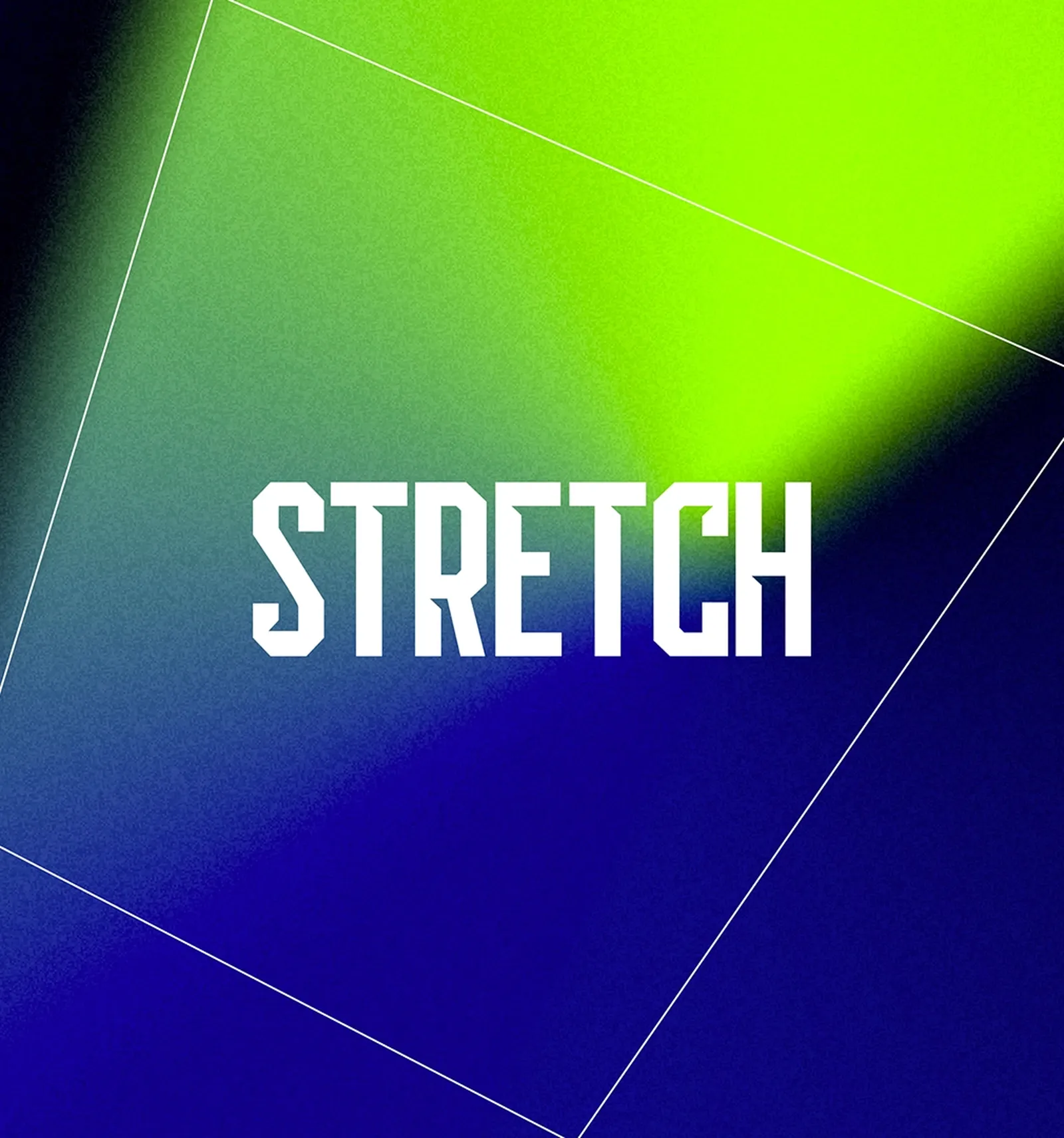
WORKING THE ANGLES
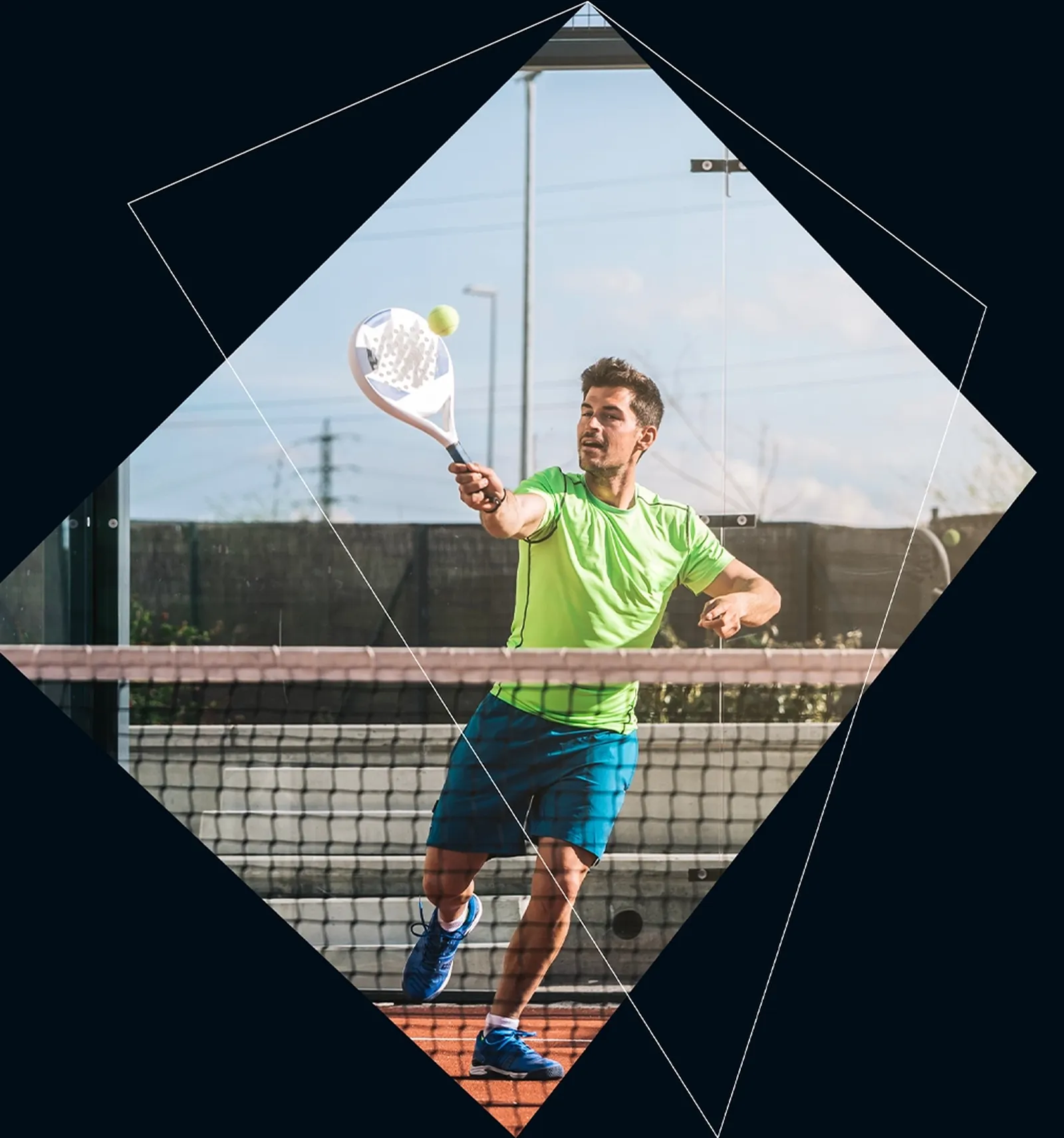
Padium’s visual language is all about capturing the essence of the sport. Padel is a fast and tactical game; as much a battle of wits as it is physical strength. Unlike tennis, the ball interacts with the walls as well as the floor, meaning angles play a huge part in the scoring of points. Finding a gap between your opponent/s is crucial to success. Our graphics speak to the unique relationship the ball has with the court.
ON AND OFF COURT
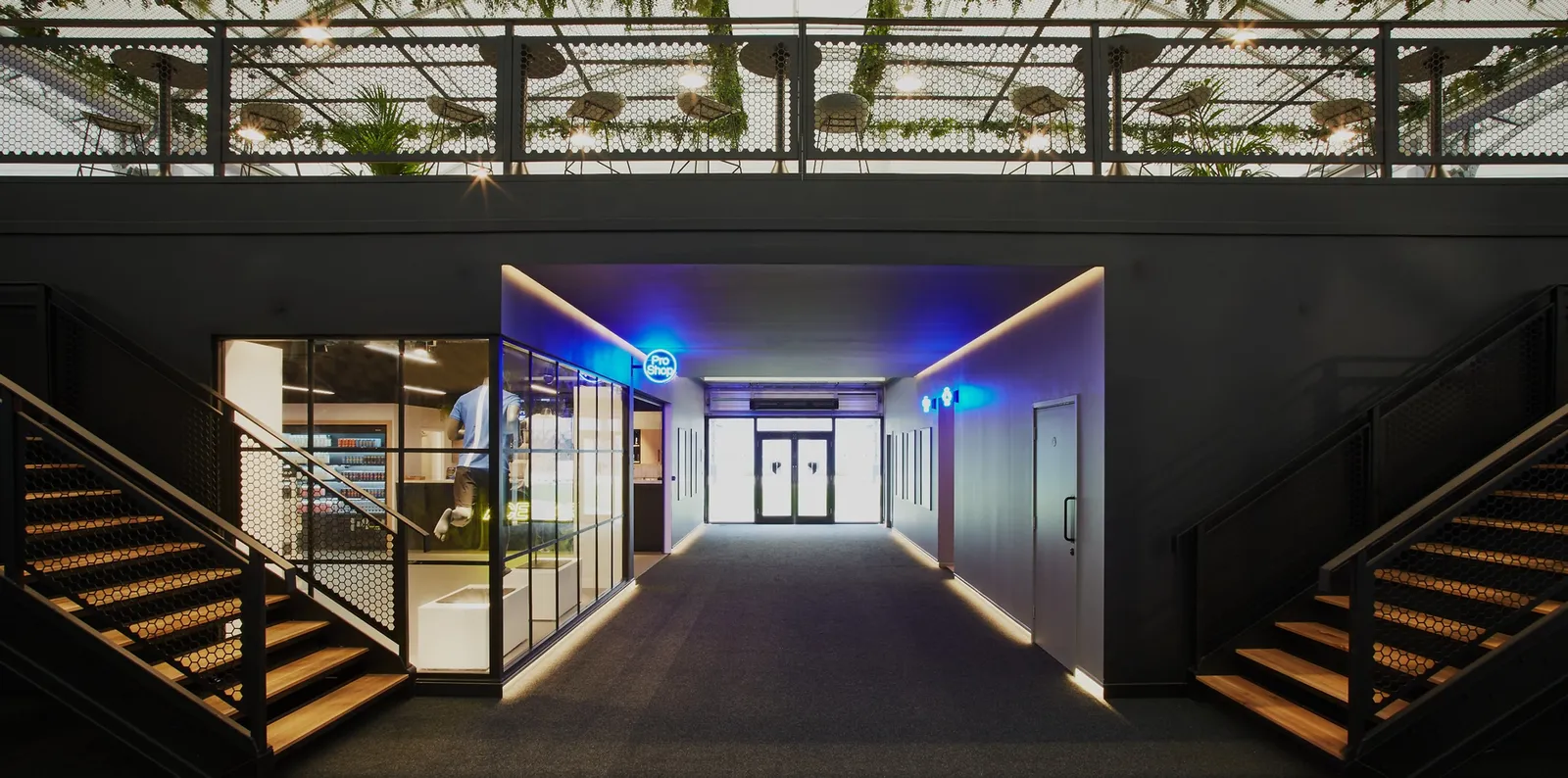
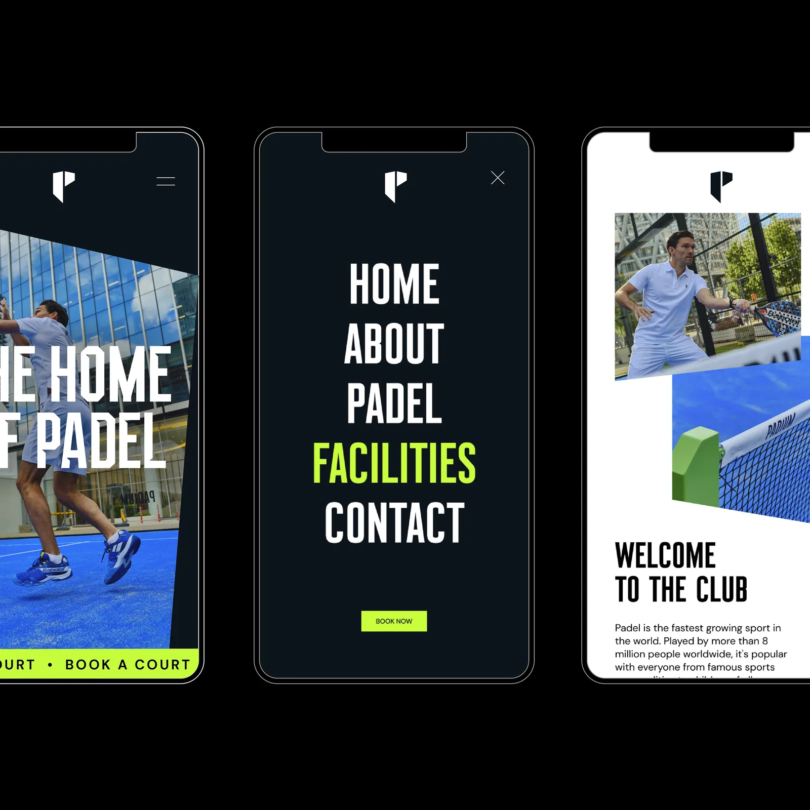
Padel is a social game, often played in doubles, it quite literally brings people together. Part of the reason for padel’s huge boom in popularity is the quick-to-pick-up-ability of the sport. Easy to learn, but much harder to master, so players will be rallying within minutes of stepping on to the court. The Padium site needed to act as part gameplay education, part social hub featuring league and leader boards, and, of course, driving users towards court bookings.
The bespoke typeface and angular structures were used throughout the UI and iconography system, drawing users through the site, eventually to the physical location.
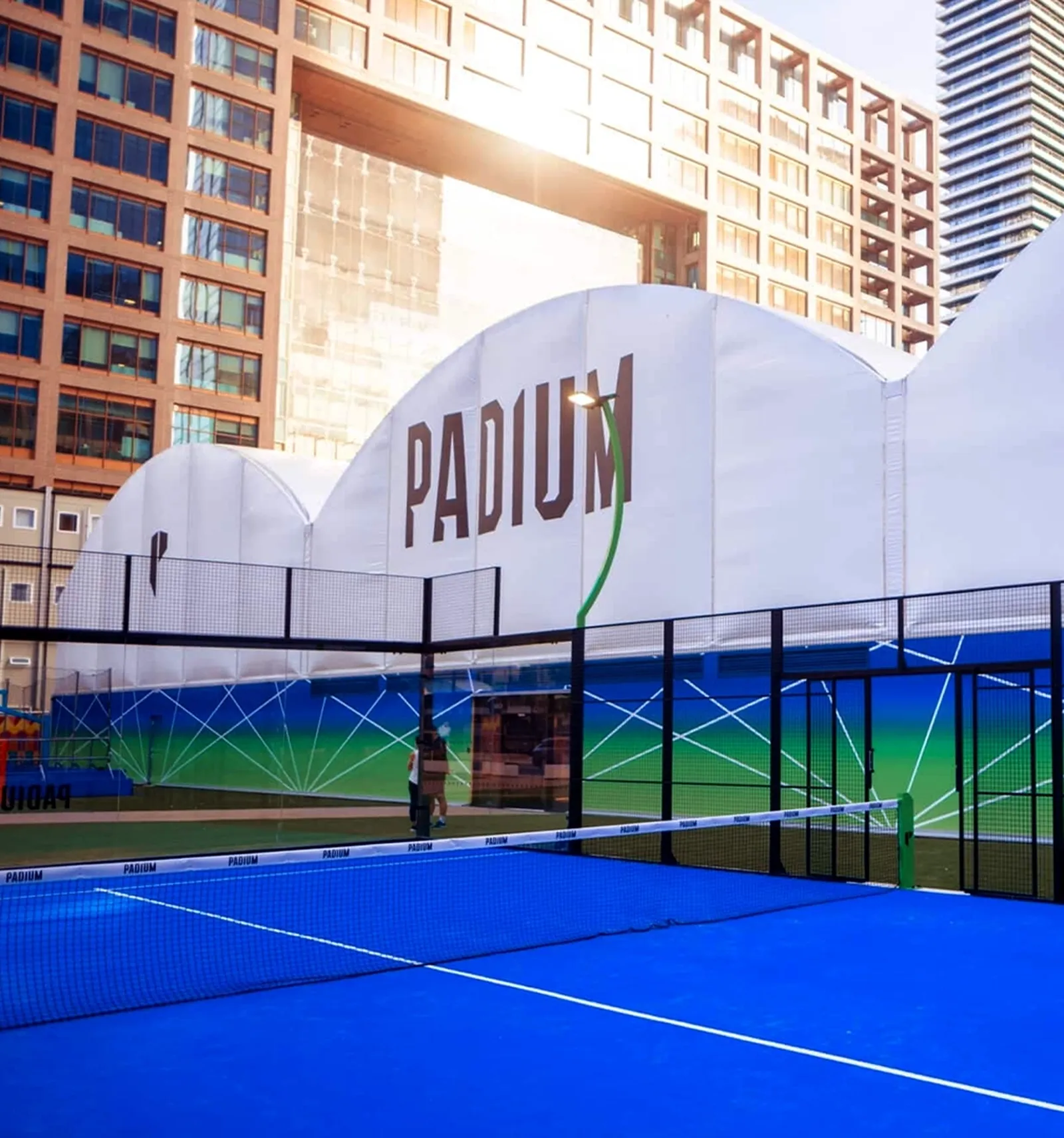
THE HOME OF UK PADEL
As brand guardians we input in the design of the space. From the earliest conversation with the Padium team there was a vision to dedicate a large portion of the space purely to hanging out before or after a game. As a testament to the ethos that Padium is more than just a space to play the sport. It’s a space for a burgeoning community to come together.
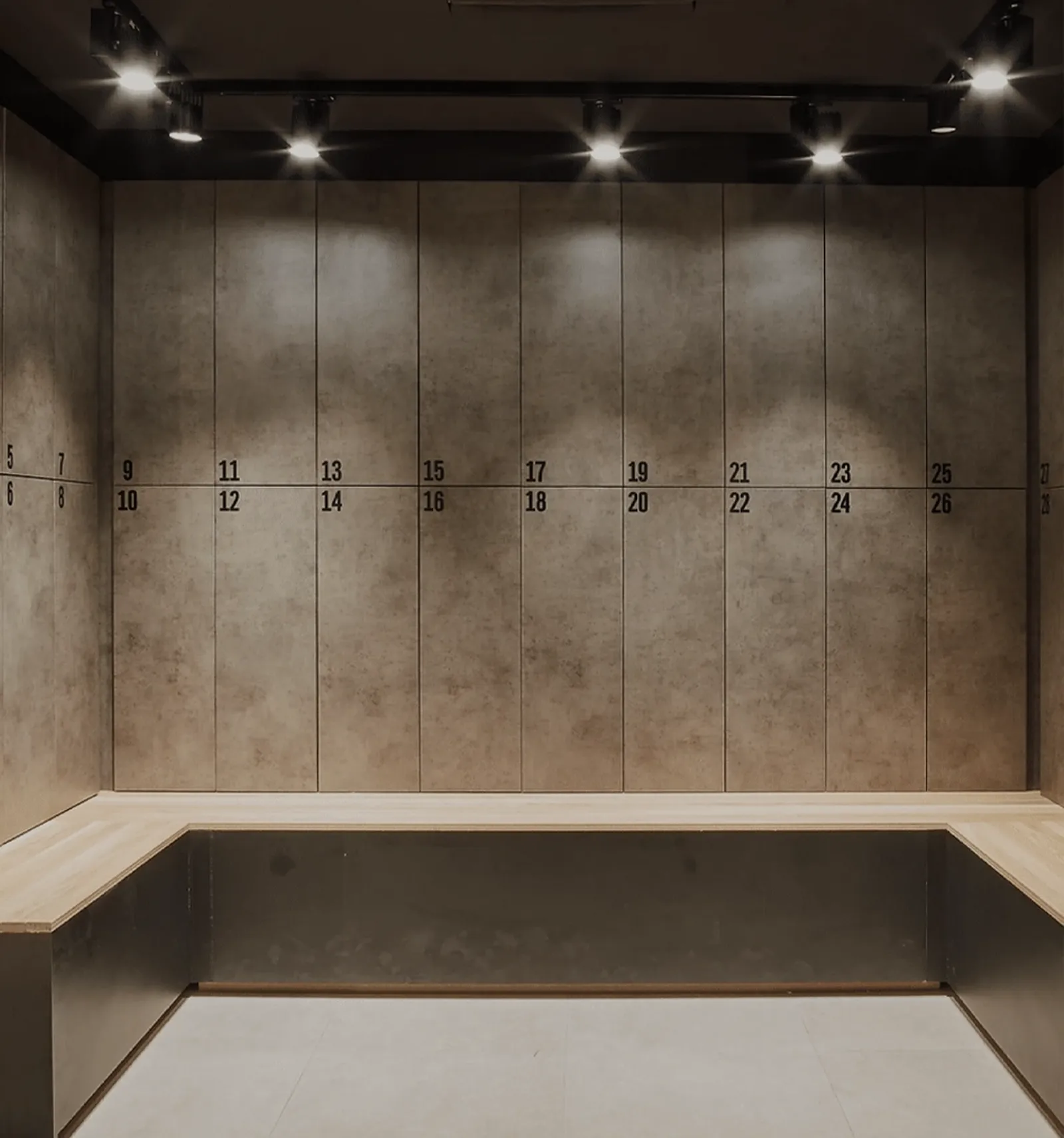
The space also needed to embody the premium quality of the brand, from the match day experience, to the club shop, the juice bar, and even the locker rooms (far removed from the changing rooms at other clubs around London.) This even carries through into their brand partnerships with some of the best brands within the world of padel, including Björn Borg, no less.