TUTHILL
A LEGACY OF ROADS, RALLIES, RACES AND RESTORATION.
Brief
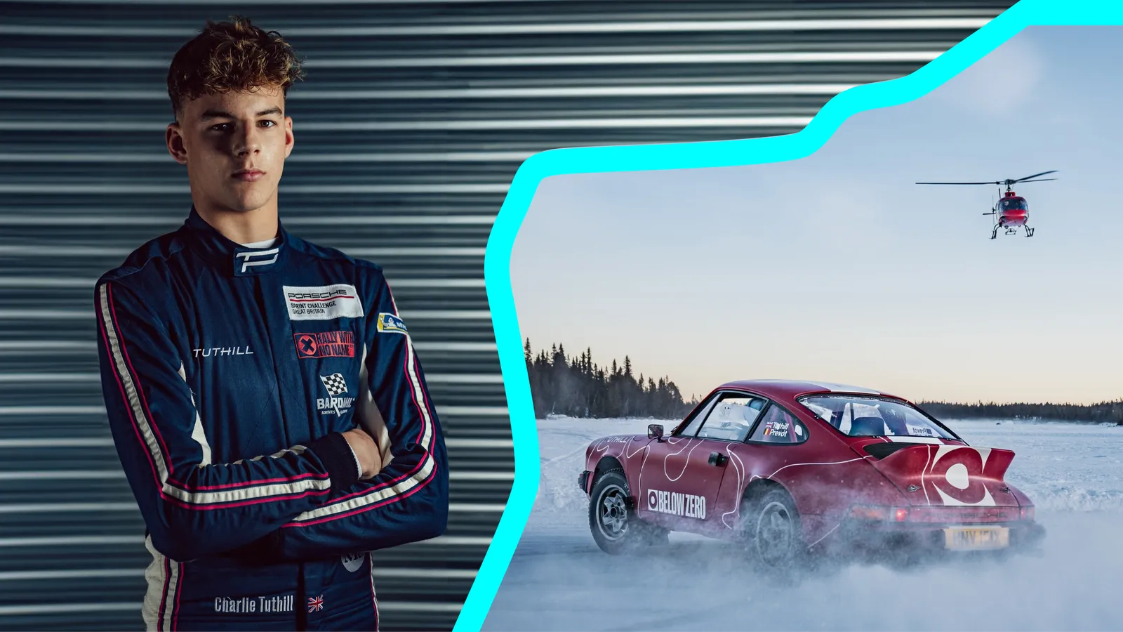
The Porsche 911 has a history that shouldn’t be forgotten. Originally built as a rally car, they were designed with a purpose: to be driven, hard. As Tuthill continues to grow, they realised they need an identity that truly reflects the experiences they offer. They are restorers, racers, and rally drivers, and it is the adrenaline and energy of rallying that we drew inspiration from when updating their brand. There is a longstanding mutual respect between Tuthill and Poppins, and we jumped at the chance to collaborate once more on a refined and distilled brand for this, exponentially growing, leader in the automotive space.
deliverables
- Brand strategy
- Visual identity
- Verbal identity
- Marketing website
- Sub-brand family identities
AS IT WAS INTENDED
Building from the strategy work, and the brand philosophy of, ‘As it was intended’ we use visceral imagery and short, emotive copy, to conjure the feeling of being in the driving seat. A feeling that, because of the new brand world, feels distinctly Tuthill. The streamlined logo pays homage to the products’ legendary heritage while remaining distinct. As the logo plays a significant role across car parts and liveries it needed to be simple, iconic and instantly recognisable.

911 RED
The Tuthill identity is purposefully bold, simple and sophisticated. Imagery is about more than just how the car looks, but also how it feels to drive. The updated colour palette was inspired by the original Porsche 911 colours, optimised for digital touchpoints and retaining their ‘911 red’ (called that with good reason - under the hood of the colour, the hex code is none other than #911911). We also created new pairings, aligning darker and lighter shades together so the brand feels brighter, more playful and closer to the energy of rallying and racing.

SOUNDS THRILLING
The Tuthill tone was developed to show who the team are, and what they’re all about. It needed to balance feeling approachable for fans and fanatics, while communicating their ultimate expertise and that they care massively about what they do. For much of the time the Tuthill voice is relatively understated, but it can change gear, and when updating the brand, we found ourselves leaning further towards the energetic side of the verbal identity. All the brand elements come together to express the excitement and the thrill of owning and driving a Porsche.

MAPPING IT OUT
These cars were made for adventures. Be that etching a route through the topography of Africa, cruising the North Coast 500, or seeing where the road takes you. Giving a nod to the sheer possibilities, we put journeys at the heart of the brand identity. This led to the creation of a supergraphics suite of visuals to be used across a lot of applications, all based on some of the most iconic race tracks, rally courses and roads in the world. The journeys of the roads follow our users as they navigate the Tuthill website, mirroring their exploration.
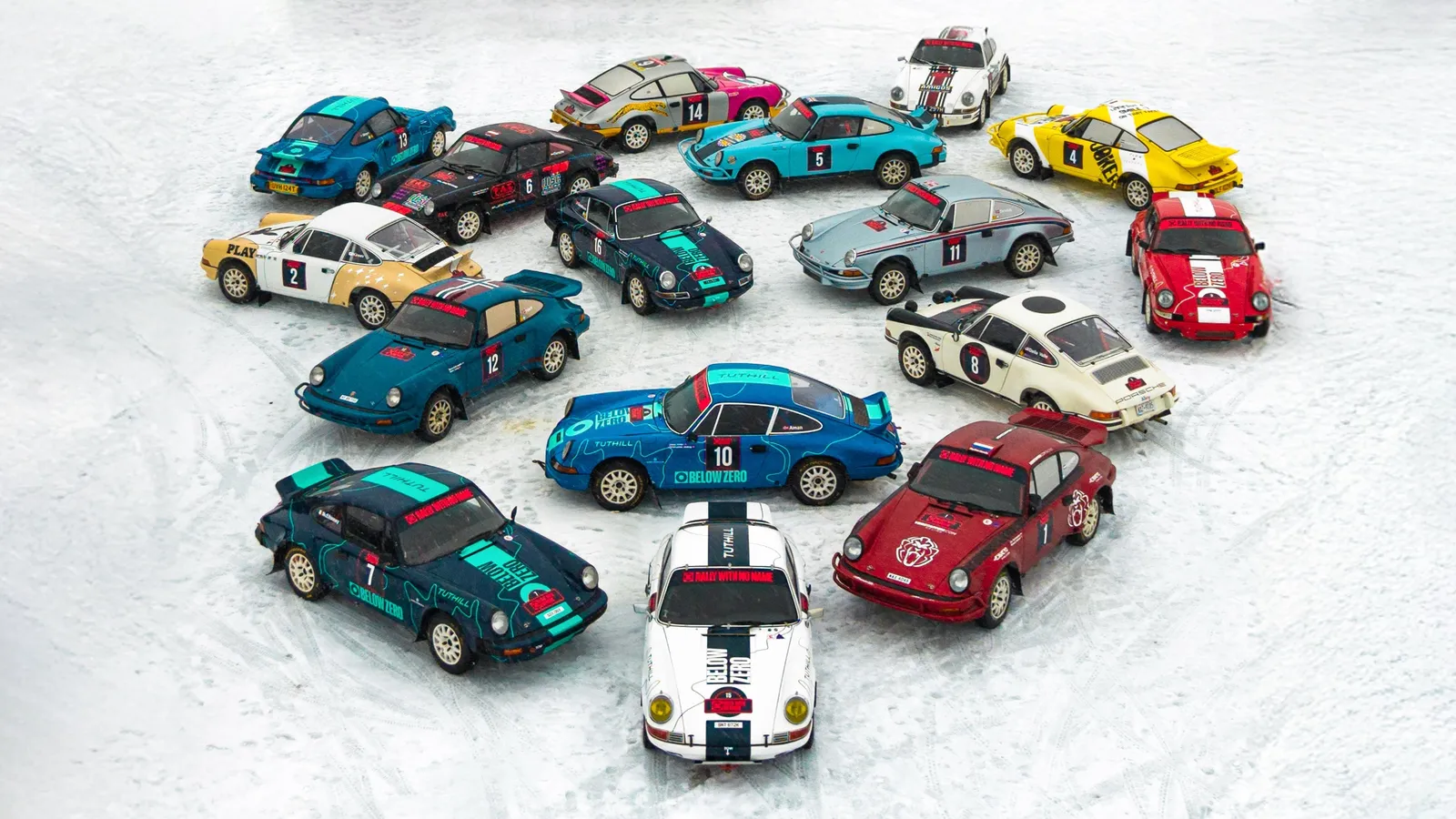
ONE BIG HAPPY FAMILY
As Tuthill continues to diversify their experience offering it became clear that they needed a scalable design system, so we built one. A system for creating a unique, but clearly related, family of logos; one for each Tuthill experience, now and in the future. The colour choice is inspired by the experience itself, but with amplified pigment and saturation to create eye-catching identities. The supergraphics of road lines are also amplified, made thicker to put more emphasis on the drive, and make the experience identifiable between its parent brand.