Meyers Manx 2.0
A brand experience unlike any other for the iconic Meyers Manx. This is where the fun begins.
Brief
The electric Manx 2.0 embodies the legendary carefree spirit of the first Meyers Manx, while looking ahead to the future. We captured this essence through modernised mid-century design cues and a tone with fun at its core; creating an updated brand and playful digital experiences, including an original Meyers Manx mobile game. All with moments of surprise, interaction and joy throughout. Because just like sand, the Manx charisma gets absolutely everywhere and is pretty hard to shake.
deliverables
- Brand strategy
- Visual identity
- Immersive digital experience
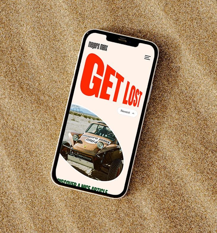
- Campaign microsite
- E-commerce
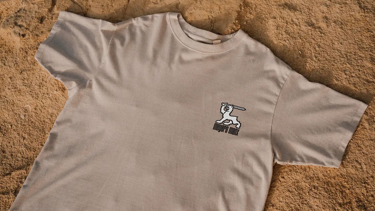
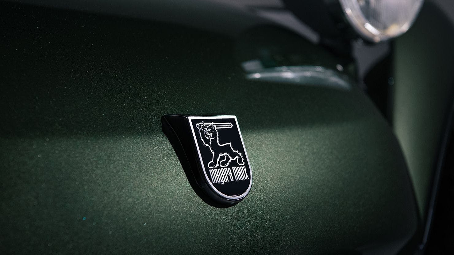
The crest
The Meyers Manx logo - iconic in its own right - has served the brand for over 60 years, but as with the Manx 2.0, it was time to update it for the 21st century. Together, the shield, the manx cat and the wordmark that make up the crest are arguably the most important brand asset. It was important we were respectful of the brand’s heritage, while also alluding to a bright future. The sword is straightened, with a hidden ‘MM’ for the keen eyed; the tail and feet features are sharpened, making the crest digital-friendly and scalable; there are hidden lightning bolts in the cat’s fur, nodding to the 2.0; and the less rounded bowls on the wordmark give us grounding.
THE CONFIGURATOR
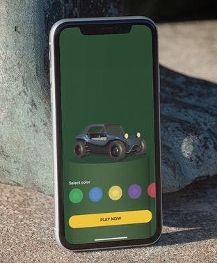
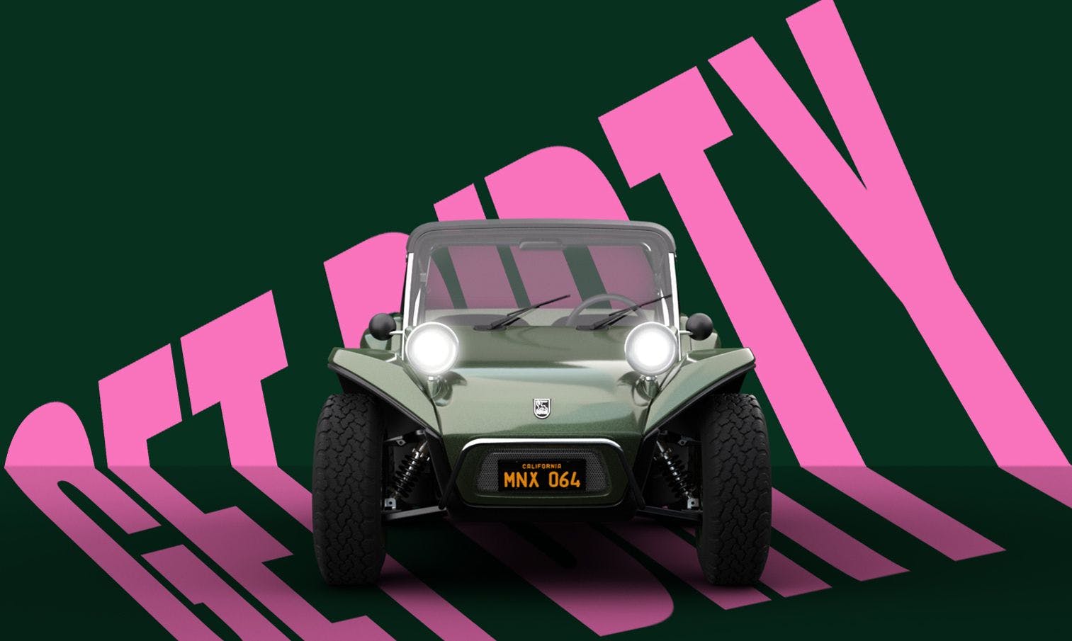
Our 3D motion designers meticulously recreated the Manx 2.0 as the first step in crafting immersive animations, bringing the vehicle to life. First, we needed the perfect render. We worked back and forth with the Manx design team to fine tune every detail, making sure we were working with a photoreal asset. Next, we created the sand- inspired animation sequences that act as the homepage hero on both the website and 2.0 microsite. Finally, we artworked all of the static shots that are seen throughout the sites. Our render allowed us to give Manx-lovers the opportunity to picture their perfect Manx. The configurator offers location options that hint towards the brand’s journey from inception to today (in the desert or in the studio), a choice of six different colours, and with or without the roof. Users can then download their ideal creation as a keepsake.
TONE OF VOICE
To embody the vehicles’ charisma and the Californian spirit we needed a tone that captured the Manx’s sense of play. After all, this is where the fun begins. We developed a TOV that promotes free-spirited behaviour, optimism and inspires adventure, while still communicating our expertise. This played out across the brand’s websites, and in the visual identity via a series of authentically Manx one-liners.