Scott Osborne
A personal and precise identity, that meets the highest standards.
Brief
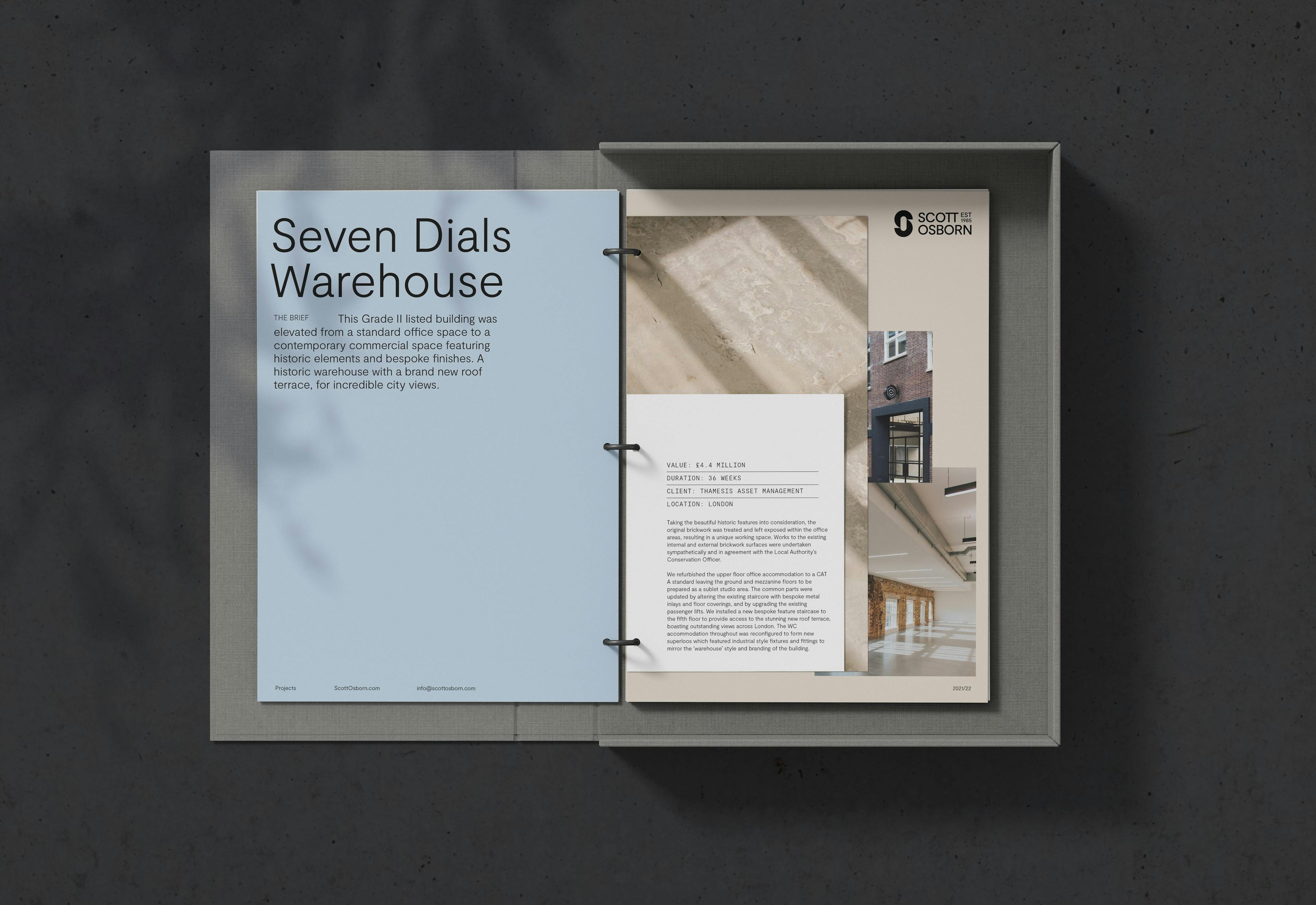
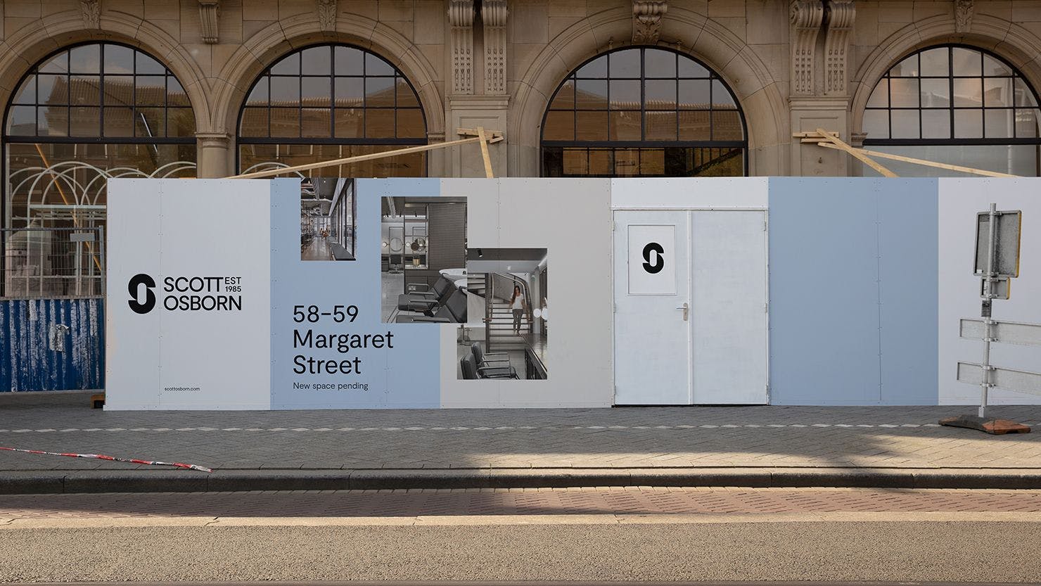
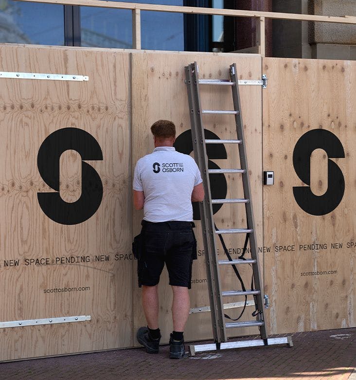
Scott Osborn are principal contractors that build, modernise and adapt spaces with an incessant attention to detail and a genuine care for their clients, often building relationships that last decades. They are the product of two promises, something we wanted to express throughout the project. From a logo that represents the partnership of both founders’ names, to a visual language that layers the macro with the micro, and a photography style that gives tactile context to their spaces.
deliverables
- Brand strategy
- Visual identity
- Tone of voice
- Digital design
- Website Production
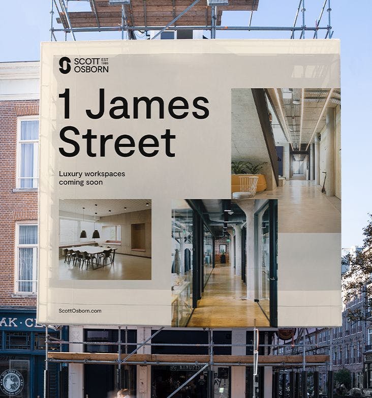
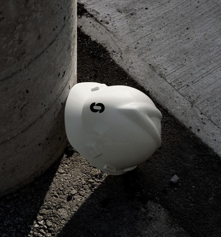
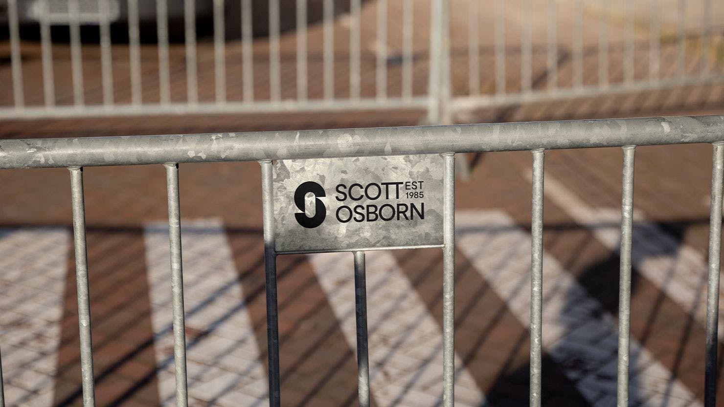
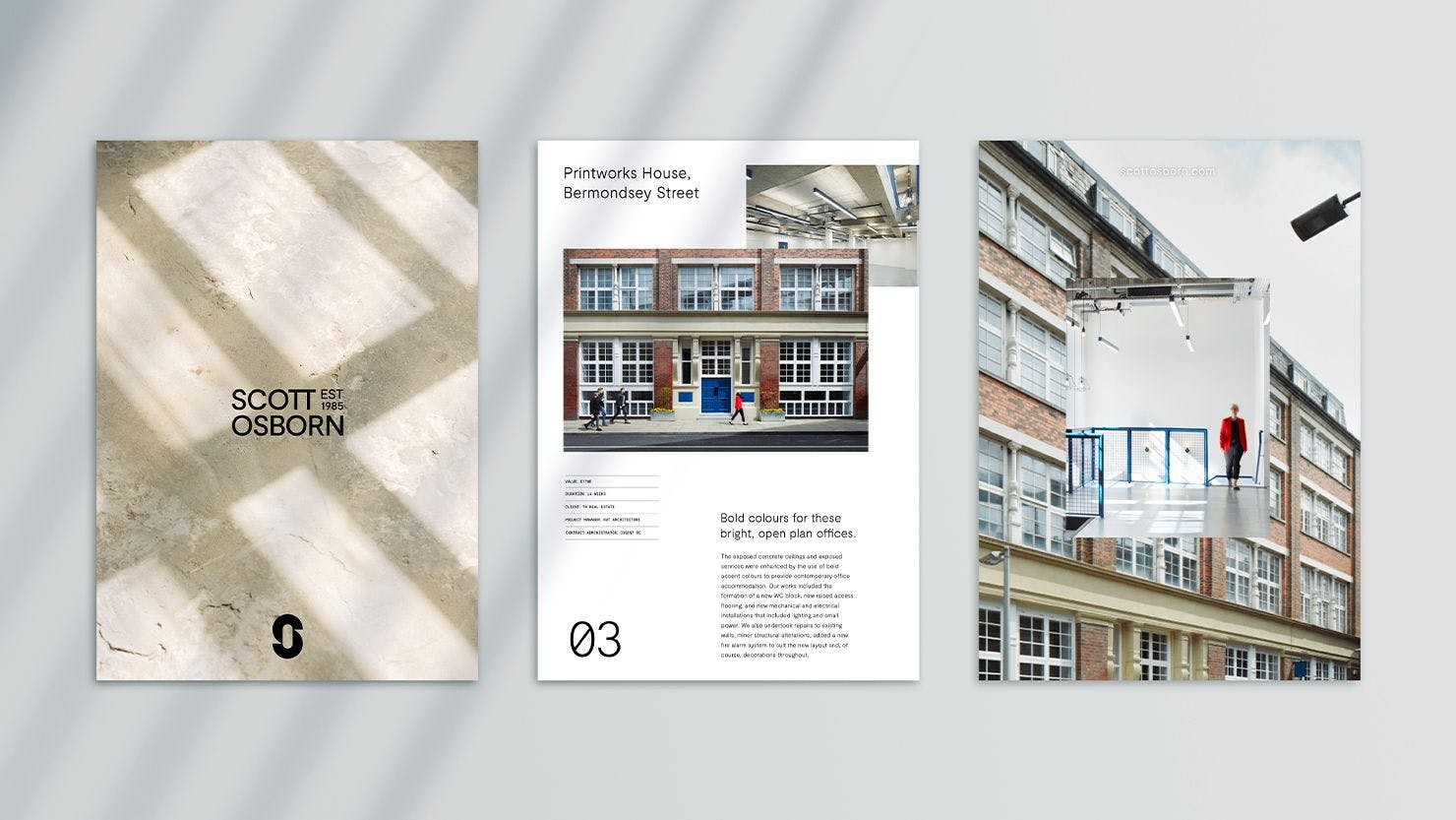
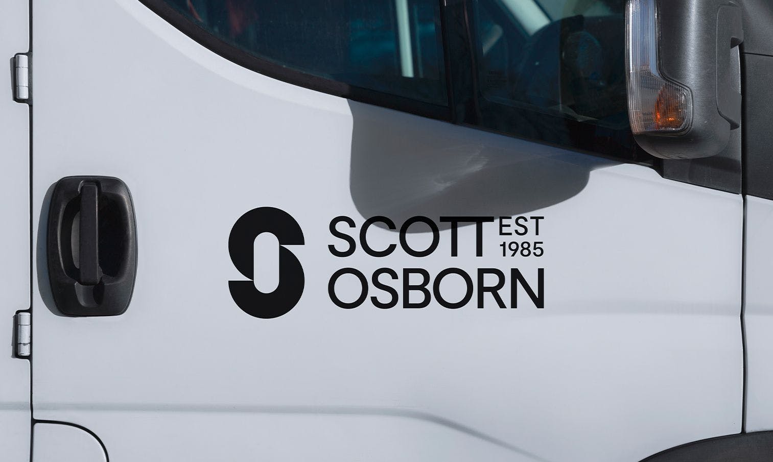
A CRAFTED LOGO
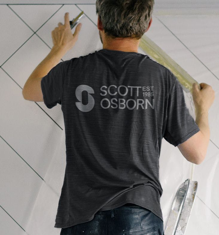
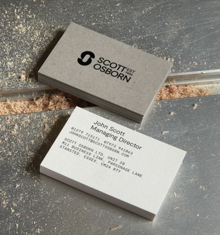
For a brand that specialises in real-world spaces, a logo is used a lot. From business cards, uniforms and sponsorships, to vehicles and huge hoardings. We needed to create a simple, recognisable mark that told a story. We meticulously blended the two partners’ initials together into a bold and unique monogram symbolising the duality of their business: Scott Osborn, personally precise.
GRAPHIC LANGUAGE
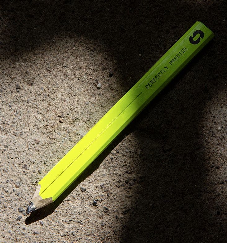
When defining the art direction, it was important for the spaces to feel relatable, familiar and lived in. Which is where shadows come in. By playing with light, we evoke a sense of time and purpose while still allowing the details of the work to shine. This gentle addition of tactile interactions within spaces is something Scott Osborn also used across their team headshots.